Iron Man Papercraft Birthday Invitations

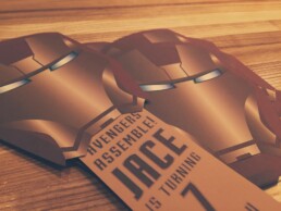
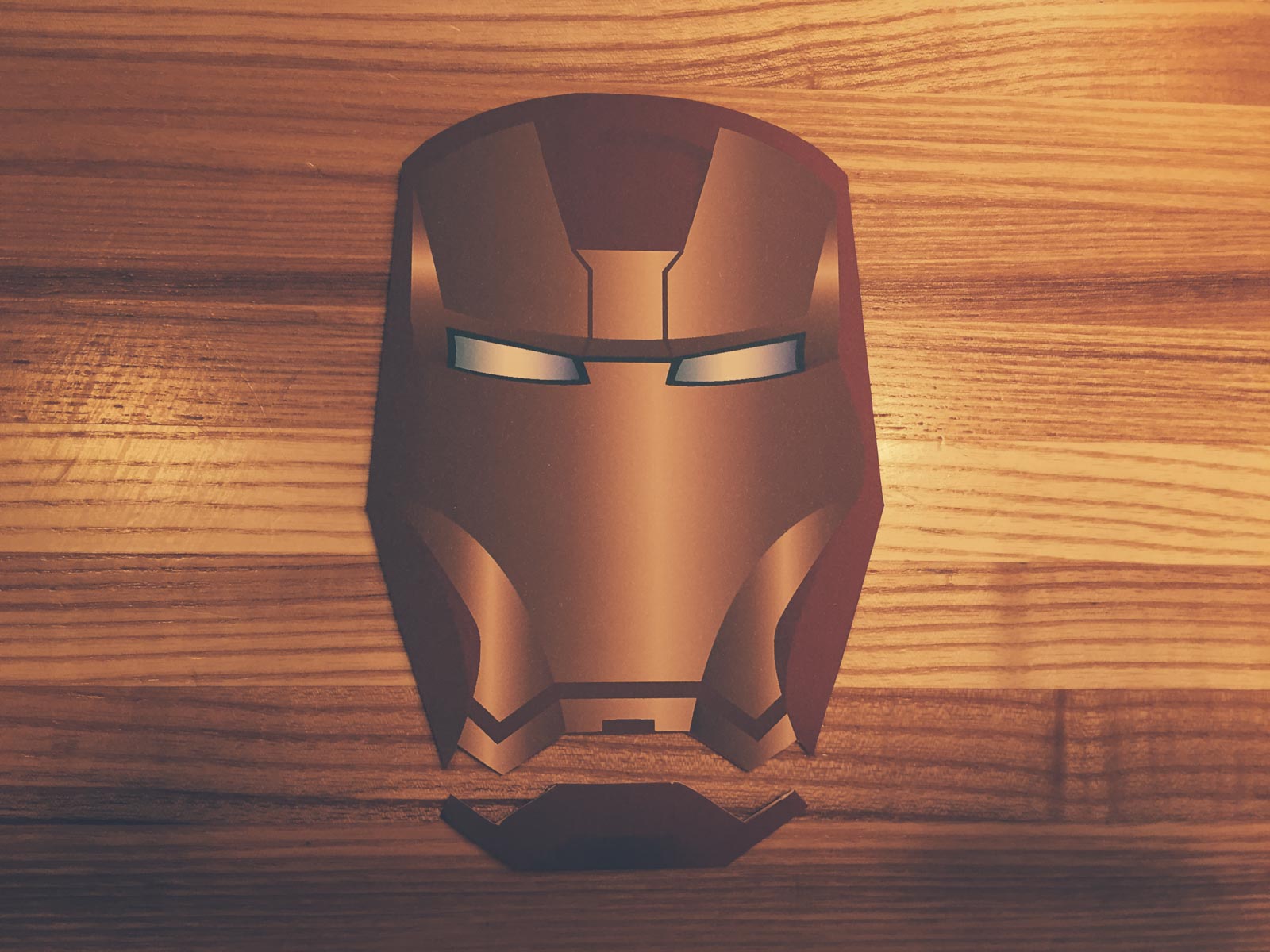
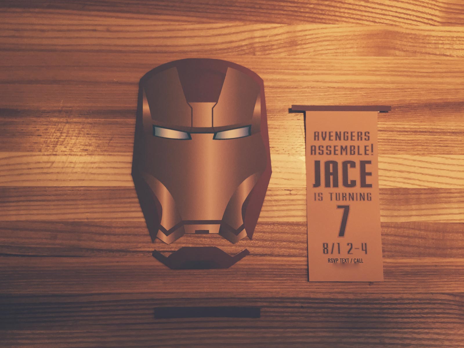
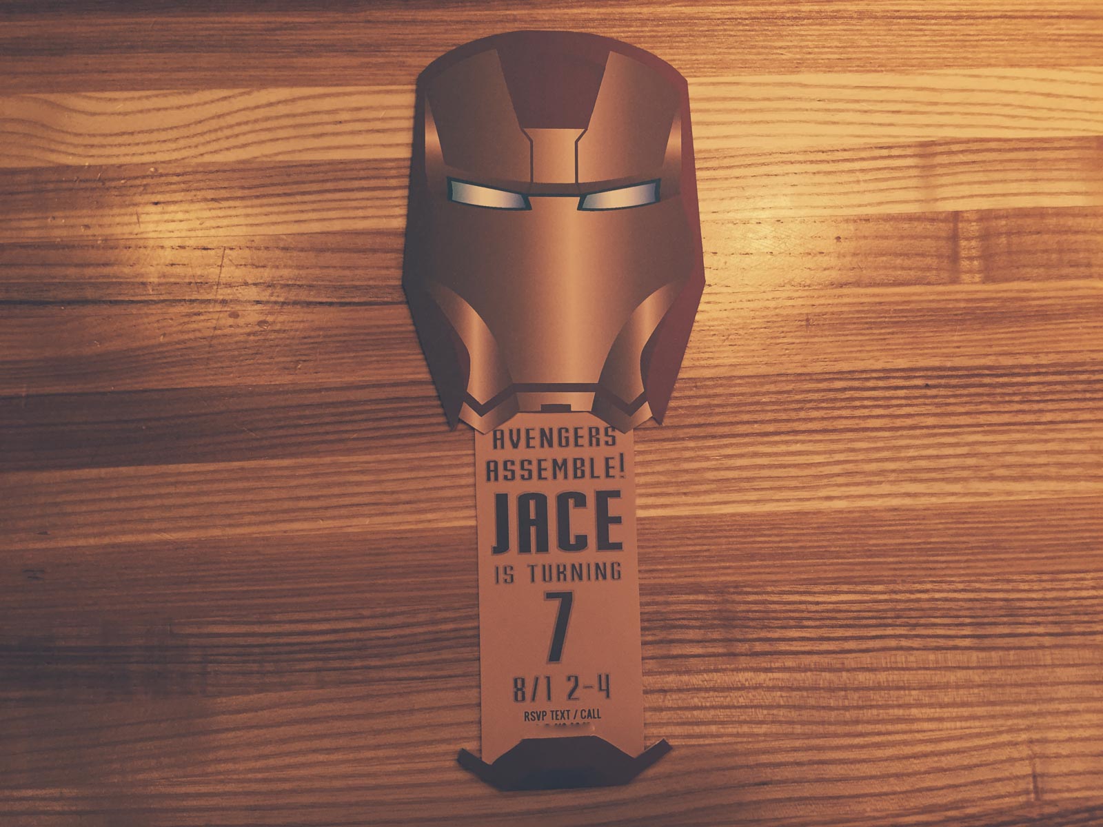
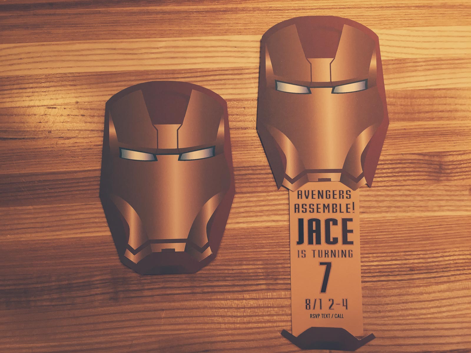
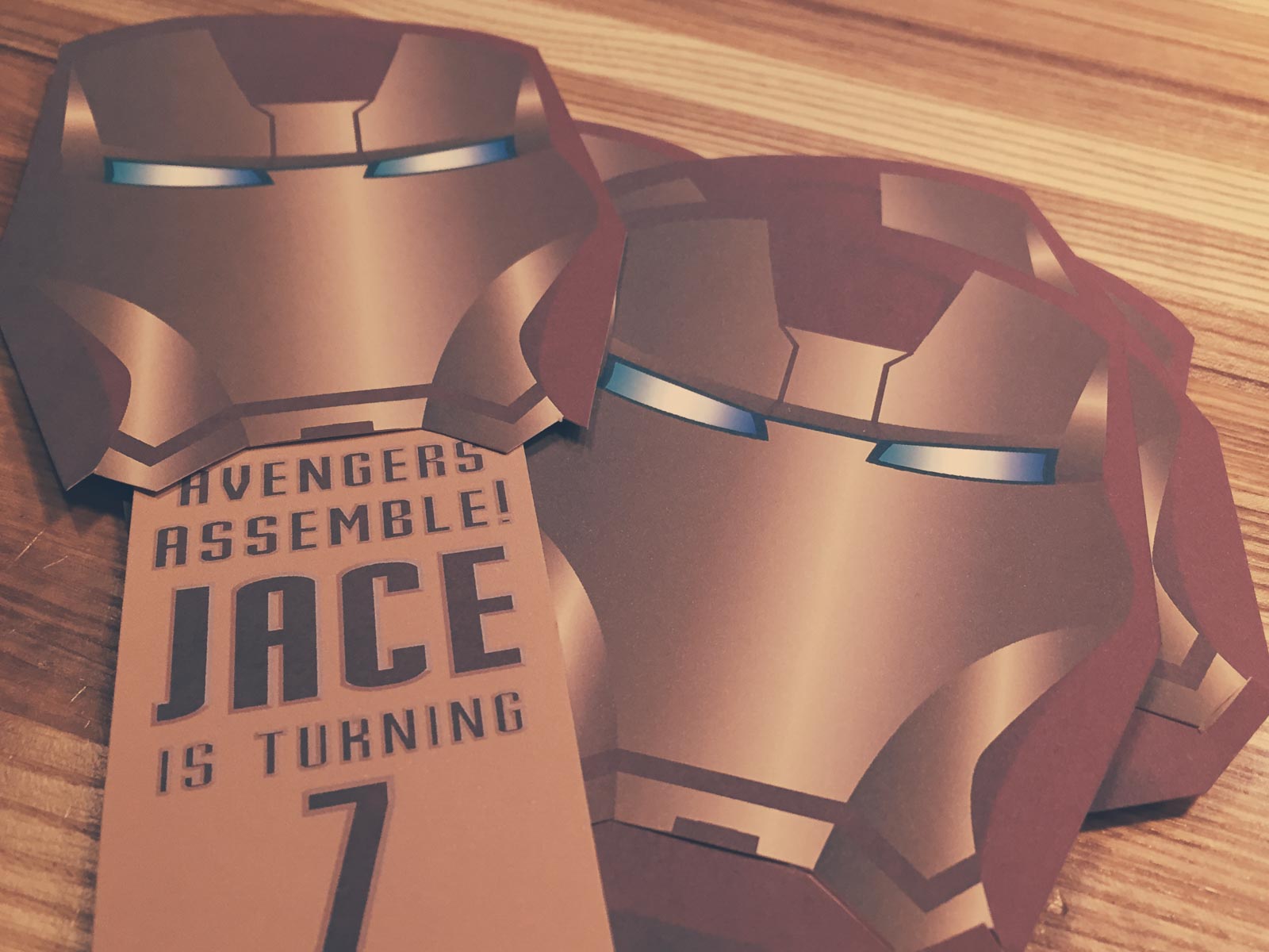
My son turned seven recently and wanted and Avengers themed party. First off were the invitations. I decided to create an Iron Man mask where the mouth slid down to reveal the party details.
This is super simple to make. It only requires a printer, scissors and a glue stick.

- Download both the mask and slider pdfs.
- Open the invite details pdf and fill in the form with your specific details. If you want to match the font you can download the free font Stark from DaFont. There are form fields for your child's name, child's age and rsvp phone number. If your child's name is too large you can adjust the size of the field by right clicking the field and choosing "properties."
- Print out as many invites as you need.
- Cut out the mask and both slider pieces.
- Cut off the bottom part of the mask as you see in the first image. You'll be attaching this to the bottom of the slider piece in a moment.
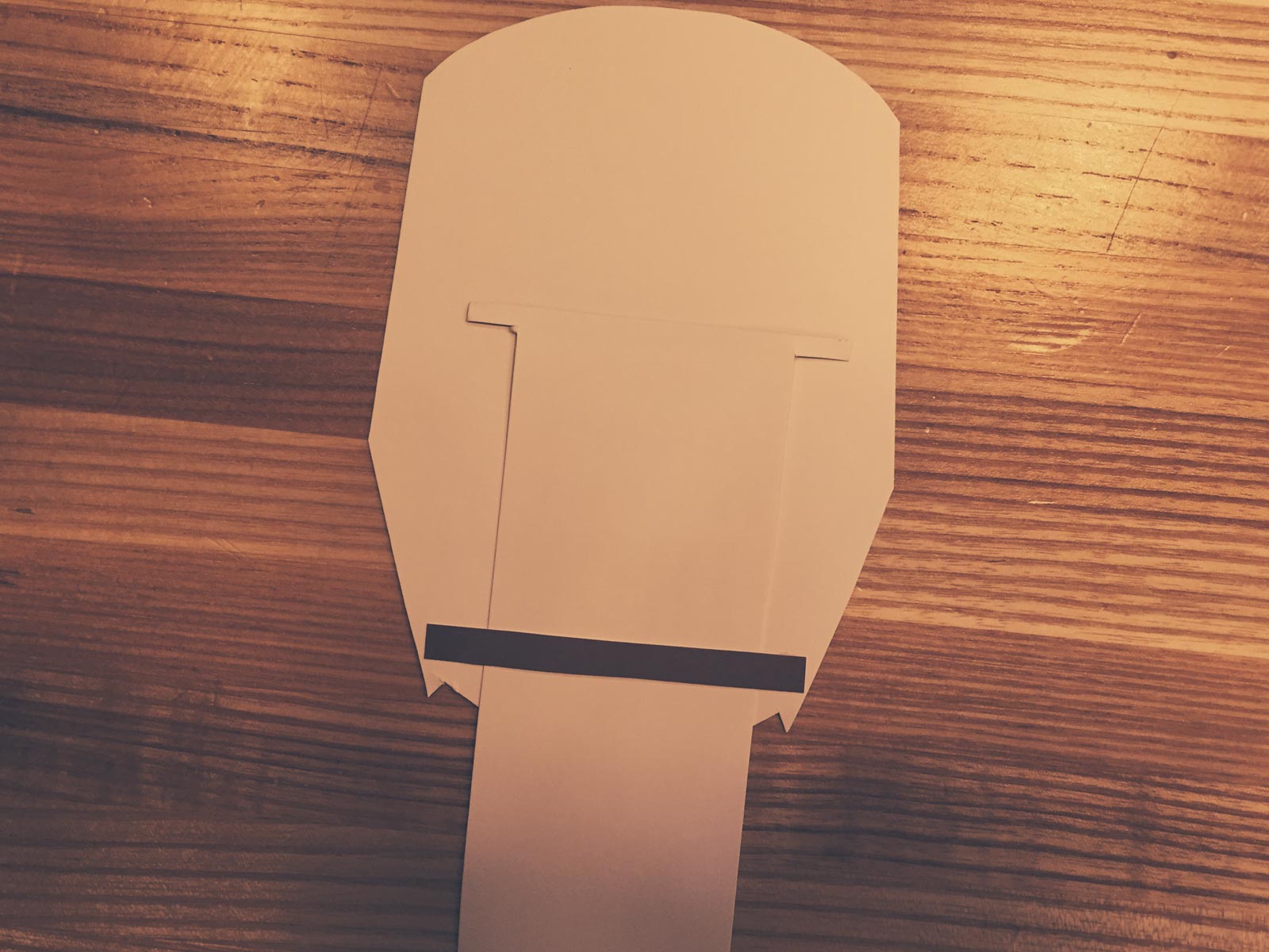
- Glue the single piece from the slider to the back of the mask near the bottom. You'll only want to put glue near the left and right edges. The slider needs to be able to slide in freely.
- Put the slider in the mask and glue the bottom part of the mask on.
- Enjoy!
Top Ten 2015/16 Premiere League Jerseys Ranked
What are the best kits for the 2015/16 season of the English Premiere League?
Here are the criteria to be considered.
Stripes or No Stripes?
If a jersey has vertical stripes it automatically goes to the bottom of the pile. The only thing they're good for is spotting a Newcastle Fan from 100 yards so you can steer clear.
Color Combinations
Does the jersey have a awesomely sick combination of electric blue and black or a disgustingly sick combo of green, yellow, and orange?
Likability of Team Wearing Them
Don't care how cool your jersey is if you're a jerk in it.
Is it Arsenal?
Always classy and near the top, are the Gunners. My favorite team gets a special bonus.
Team Logo/Crest
Does it fit in well on the jersey? Does it include ridiculous hard to read type?
Sponsor Coolness
Do I want to be a shill for wonga.com or bet365? Nope.
Sponsor Logo
Does it fit the jersey or does it look like a 3rd grader took a glue stick and slapped a giant piece of paper on it?
Manufacturer
Who made this thing? Who gets the credit? Who is to blame?
Bonus
Some kits and teams deserve special recognition. Others deserve a kick in the pants.
THE BEST OF THE BEST
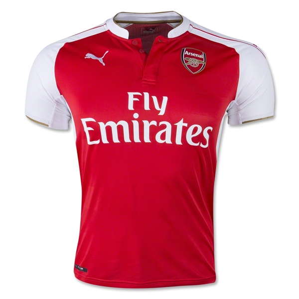
1. Arsenal Home
Vertical Stripes: 5
Nope.
Color Combination: 5
Classy combo of red and white is hard to beat.
Likability of Team: 5
Is It Arsenal: 5
Yes. Hey, a homer has to get in extra points somewhere right?
Team Logo/Crest: 5
How can you not like a logo that is simply a gun? Point for simplicity and coolness.
Sponsor Coolness: 3
Apparently its a nice airline, and I would much rather rep an airline than a gambling site but it is also a pushy sponsor. They couldn’t just say “Emirates” they have command me to sit on their plane.
Sponsor Logo: 3
Its not bad. The all text works on top of just about any design.
Manufacturer: 4
Puma has a coolness factor right now though I don’t like that they slap it on the jersey 3 times.
Total: 38
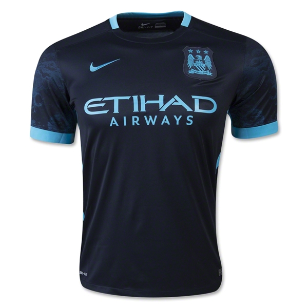
2. Manchester City Away
Vertical Stripes: 5
No.
Color Combination: 5
Electric blue on navy with some subtle prints on the sleeves? Yes please. This is striking. By far the best color combo in the league this year.
Likability of Team: 2
Still don’t like them, but they get points for finishing below Arsenal last season.
Is It Arsenal: 0
No.
Team Logo/Crest: 5
The eagle in electric blue is possibly more cool than Justin Timberlake in a tux.
Sponsor Coolness: 3
Any national airline of a place that builds palm tree islands just because is pretty cool.
Sponsor Logo: 4
I like to say Etihad. Say it with me. Etihad. That’s nice.
Manufacturer: 5
That swoosh couldn’t look any better on a uniform.
Bonus: 5
This is an amazing kit. If I was picking a team to follow based solely on its kit. I would pick Man City no doubt.
Total: 34
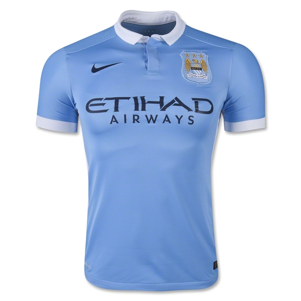
3. Manchester City Home
Vertical Stripes: 5
None here.
Color Combination: 4
Powder blue, navy blue with a dash of gold thrown in is pretty sweet.
Likability of Team: 2
It is a requirement to dislike teams bought by rich people who use them as their plaything.
Is It Arsenal: 0
No.
Team Logo/Crest: 5
Gotta give credit where credit is due. This is an awesome crest. As American’s know, the eagle is the warbird who makes all dreams come true. Slap an eagle on something and it instantly is more intimidating, cool, and ready to open a can.
Sponsor Coolness: 3
Airlines are fun because they take you places, like out of Manchester! I’m here all night folks!
Sponsor Logo: 4
Its simple and mysterious. Has a razor sharp feel that says precision.
Manufacturer: 5
The Nike swoosh is the pinnacle of manufacturer logos.
Bonus: 2
I like that Nike understands they don’t need to slap their logo on the shoulders. They know one is powerful and enough.
Total: 30
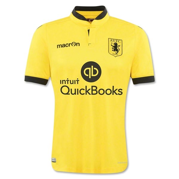
4. Aston Villa Away
Vertical Stripes: 5
There are none
Color Combination: 5
Simply awesome. This is a jersey I would buy because it looks cool.
Likability of Team: 3
Meh. Not much to like or hate.
Is It Arsenal: 0
Aston Villa is in fact not Arsenal.
Team Logo/Crest: 5
Classy, simple and cool. Fantastic choice to go all black.
Sponsor Coolness: 2
I’ve used quickbooks and there is nothing cool about it.
Sponsor Logo: 2
The “qb” is actually pretty good. If it were only that you would have an amazing sponsor logo. Even adding in “Quickbooks” isn’t all bad, but adding in the off center “intuit” ruins everything.
Manufacturer: 2
Nothing says relegation bound like the jersey manufacturers of Millwall FC. Who? Exactly.
Bonus: 5
I liked this kit so much I invented the bonus category because of it.
Total: 29
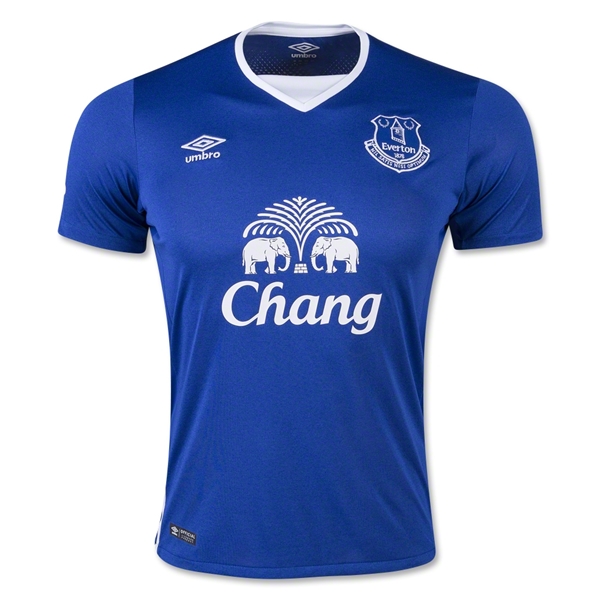
5. Everton Home
Vertical Stripes: 5
None appear on this kit.
Color Combination: 3
Simplicity will always work well on just about any kit. Its a little boring but I would rather have a little boring than eye-gouging green, orange and yellow.
Likability of Team: 4
Everton seems to be America’s default EPL team. They’ve had a number of high profile American players including Tim Howard, Brian McBride, and Landon Donavan. They are also a perennial underdog.
Is It Arsenal: 0
No.
Team Logo/Crest: 3
Not bad. Its a typical European crest. Tons of symbolism and small letters. Not great, not terrible.
Sponsor Coolness: 4
Beer and football seem to go together. Also, after the tsunami of 2004 hit Thailand, Everton and Chang donated so much money to an affected region they renamed it Everton-Chang. That’s pretty cool.
Sponsor Logo: 3
For an Asian sponsor, this logo is near the top. Still looks odd on an English football jersey but its okay. Points for all white and nice symmetry.
Manufacturer: 4
Classic and simple. Umbro is soccer.
Bonus: 2
Tim Howard, the bearded wall plays for this team.
Total: 28
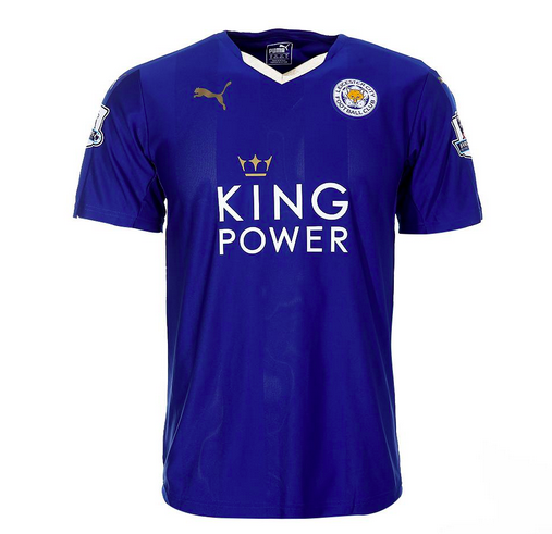
6. Leicester City Home
Vertical Stripes: 5
hey went smartly vertical stripe free.
Color Combination: 4
The royal blue and gold always work well. The subtle gradients also look nice in contrast to Puma’s other away kits with argyle gradients that look horrid.
Likability of Team: 3
Meh. Their highest ever finish in the top flight of English football was second…back in 1928. Not much to see here.
Is It Arsenal: 0
No.
Team Logo/Crest: 3
It couldn’t be more English. As Leicestershire is known for fox hunting the fox was the natural choice for a mascot. It is simple enough and gladly doesn’t have a fierce “I’m going to kill you” look most American animal logos have.
Sponsor Coolness: 3
King Power is a travel retailer. They lose points for contributing to absurdly high airport prices but gain points for having mysteriously cool duty free shops. I always feel like a secret agent when I see one and want to browse like I'm up to something.
Sponsor Logo: 4
Thai logos seem to work well for a Western Audience. King Power recently revamped their logo and this version works very well on Leicester City’s kits.
Manufacturer: 4
Puma is simple and small. Not bad.
Bonus: 2
The crown on the revamped logo is splendid.
Total: 28
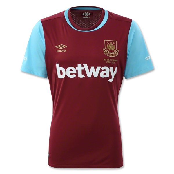
7. West Ham United Home
Vertical Stripes: 5
There is a stripe but it is not vertical.
Color Combination: 4
These look a lot better in live action then they do by themselves. The maroon and powder blue work.
Likability of Team: 3
They would have gotten a four but they beat Arsenal yesterday and I’m a little bitter. My cousin and friend like this team and I like them so West Ham is a winner. Plus their nickname is the Hammers. That’s pretty cool.
Is It Arsenal: 0
No.
Team Logo/Crest: 4
The English love their castles. And they should. Castles are fun. Add in a couple hammers, some crosses and you’ve got a really well done crest.
Sponsor Coolness: 1
Can’t get on board with gambling sites. I also keep thinking it says Beltway and that’s weird.
Sponsor Logo: 4
Props for single color, all text. Looks nice, even though I still think it says Beltway.
Manufacturer: 4
Umbro again, is classic soccer to me.
Bonus: 2
They have two home kits this year - one normal and one to represent the final year at their stadium. It is also well done and not crazy like some teams might go for.
Total: 27
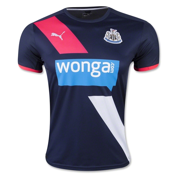
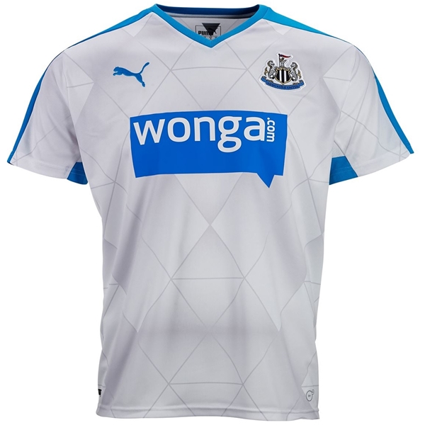
8. Newcastle United 3rd
No Vertical Stripes: 5
Color Combination: 4
They’re stuck with the sponsor logo blue but compliment it well with navy and salmon. Great accents.
Likability of Team: 2
I’ve always equated Newcastle to Raiders. Its probably the Black and white stripes and generally thuggish vibe. Any team that reminds me of the Raiders reminds me of losing.
Is It Arsenal: 0
No.
Team Logo/Crest: 3
Super busy with all sorts of stuff flowing. The seahorses do their best to look tough but they just aint. I do like the stripes in the shield but that’s about it.
Sponsor Coolness: 1
I first thought it said Wonky. That, and financial companies aren’t exactly cool.
Sponsor Logo: 1
Horrid. Just Horrid.
Manufacturer: 5
The jersey is so clean the Puma logo looks very good.
Bonus: 4
I really like the sash. I wouldn’t think I would, and even though you might think a swimsuit competition is coming up next, it works and works well.
Total: 25
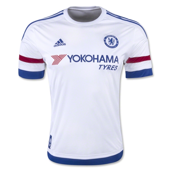
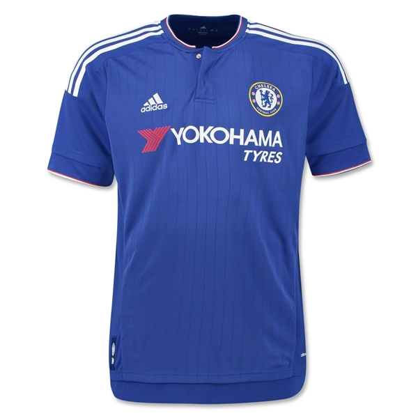
9. Chelsea Away
(Technically Chelsea and Newcastle tied but I decided that he tiebreaker was likability. So Chelsea loses.)
No Vertical Stripes: 5
Color Combination: 5
Crimson, white and blue almost always work - especially when the primary color is white which gives it an extra clean feel. Being a dirty nasty team, this is important for them.
Likability of Team: 0
As an Arsenal fan I’m obligated to despise pretty much everything about this team. The away jersey is the one exception.
Is It Arsenal: 0
Nope. It is definitely not Arsenal.
Team Logo/Crest: 4
Single color, cool lion and very soccer. Not bad Chelsea, not bad.
Sponsor Coolness: 2
Tyres are definitely not kool.
Sponsor Logo: 1
The simple Samsung logo would have been much better. Its not bad, but anytime you have to place words to the left or right underneath it loses symmetry and impact.
Manufacturer: 5
Adidas is classic and simple. Love the 3 stripes on the shoulders.
Bonus: 3
The stripe combos on the sleeves, shoulders, and bottom of the kit are pretty slick.
Total: 25
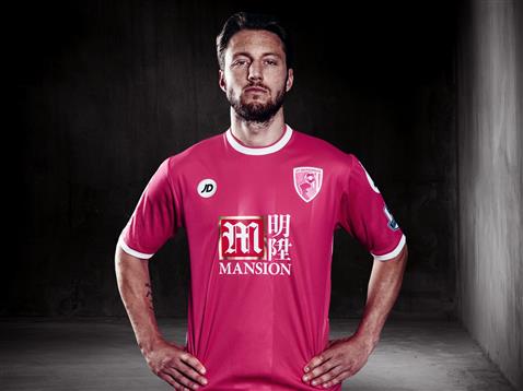
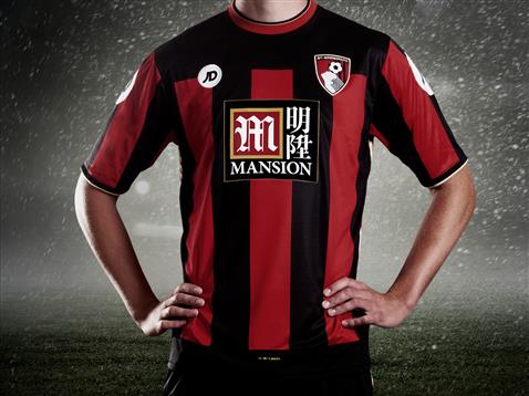
10. Bournemouth 3rd
No Vertical Stripes: 5
Color Combination: 5
I’m a big fan of simple color design done well. Pink is an odd choice at first but complimented with simple white and having the shorts and socks match really work. This kit makes the top ten on the strength of its colors. It overpowers all the other really negative elements.
Likability of Team: 2
Unless you’re from Bournemouth (assuming its a city) you probably didn’t even know they got promoted.
Is It Arsenal: 0
No. Bournemouth is not Arsenal.
Team Logo/Crest: 1
This crest is an absolute horror. The only thing that saves it from getting a flat zero is the flat 2 color design.
Sponsor Coolness: 0
Casino and gambling sponsors spell cheap and easy money.
Sponsor Logo: 1
Like most Asian sponsors, this doesn’t translate well to a western audience. It is slightly better than their home/away kits because you don’t have that ridiculous box behind it – again saved by the color scheme.
Manufacturer: 3
Clean and simple it works. Would have been higher except those logos on the shoulders are so large, you could probably land a helicopter on each.
Bonus: 4
Points for giving money from sales to breast cancer research. Imagine if an NFL team donned all pink!
Total: 21
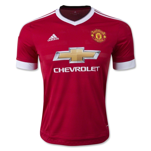
11. Manchester United Home
(Man U and Bournemouth tied but since I don't like Man U they get the boot. They should consider themselves lucky to make the list.)
No Vertical Stripes: 5
Color Combination: 4
Red and white with a splash of gold is always classy.
Likability of Team: 0
Man U is slightly ahead of Tottenham only because I’m required to hate Spurs the most. I can’t get away from constantly hearing about them because my assistant is a massive fan which makes him a massive pain.
Is It Arsenal: 0
No. Most definitely not.
Team Logo/Crest: 2
Classic, but typically evil. Nice pitchfork you devil worshipers.
Sponsor Coolness: 5
American car manufacturer on an EPL jersey. That is cool.
Sponsor Logo: 1
The metal gradient absolutely kills me and this kit. As much as I hate ManU this is a quality kit save for this abhorrent logo choice. If they would have done a white outline of the Chevy logo this kit goes right to the top.
Manufacturer: 5
Much like Chelsea, Adidas has brought a retro flair which really looks good.
Bonus: -1
For being Man U.
Total: 21
Honorable Mention
Chelsea Home - clean yet boring.
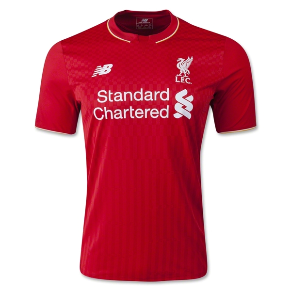
Liverpool Home - again, classic but boring.
Newcastle United Away - Despit the terrible sponsor logo, Puma's argyle works here for some reason.

Watford Home - Its like a bad accident. You can't look away. It is horrifyingly appealing.
The Worst of the Worst
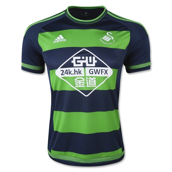
-1. Swansea City Away
No Vertical Stripes: 0
Yes I know the stripes are horizontal but if you turn your head to the side they’re vertical. And that’s kind of what you do when you see this jersey. You inquisitively tilt your head to the side because you’re not quite sure what you’re looking at.
Color Combination: 1
Neon green and navy aren’t a bad combo as long as one is an accent and not the full thing. These massive green stripes look like highway worker at a rave. Just awful. One stripe and you’ve got the making of a sweet kit.
Likability of Team: 2
I’ve always been intrigued by Swansea City. Not sure why. Maybe its the allure of the swan… But they’re a middling also ran as well.
Is It Arsenal: 0
No they are not Arsenal.
Team Logo/Crest: 4
Swans aren’t exactly what you think of when there are sports teams involved but this is a well designed logo. Simple, stylish and memorable. Its the most redeeming part of this jersey.
Sponsor Coolness: 4
They deal in gold so that’s pretty cool.
Sponsor Logo: 0
Again, Asian logos don’t translate well. This one reminds me of a 24k modem. At least its in one color and has a knockout background, though I don’t really want to see that background.
Manufacturer: 0
It was Adidas’ choice to make these hideous kits so they bear the brunt of this penalty.
Bonus: 0
The home jersey, hideous logo and all isn’t bad which makes their away kit all the worse.
Total: 11
-2. Bournemouth Home
Vertical Stripes: 0
Vertical stripes are present and very ugly.
Color Combination: 3
Red and black are always competing for dominance, but if you’re going to do vertical stripes better to have low contrast.
Likability of Team: 2
Unless you’re from Bournemouth (assuming its a city) you probably didn’t even know they got promoted.
Is It Arsenal: 0
Team Logo/Crest: 0
Any crest that has an actual soccer ball in it loses points since. This one is especially bad because at first glance I thought it was a bird but actually is a human head. Looks like it was designed by a dude at the local pub for his weekend team.
Sponsor Coolness: 1
Casino and gambling sponsors spell cheap and easy money.
Sponsor Logo: 0
Way too busy. Because of the vertical stripes they have to put a black square behind it all. Tacky and ugly.
Manufacturer: 1
Those vertical stripes kill everything. The JD on the front is actually simple and nice but the need to put it in a filled circle ruins it. Then add in the massive manufacturer logos on the sleeves and this jersey is officially one of the worst.
Bonus: -1
I went to their team site for closer look and the shop was under construction. Maybe they are building some new jerseys to sell. A week into the the season starting and their online store is under construction??? Are you kidding me?
Total: 6
-40. Norwich City 3rd
There are hardly words to describe... No rankings for this monstrosity. It gets a strait zero across the board. Whoever thought it was a good idea to put large green, orange and yellow stripes together must either be a Tottenham fan or certifiable.
What are your favorite kits for his season? Hit me up in the comments.

Why I Chose Squarespace Over WordPress
It was the summer of 1997. I had just graduated high school and was preparing to start my freshmen year of college.
During that last summer some friends and I attempted to start our own pop a cappella group. Think Pentatonix 15 years before it became cool...
We needed a website. So I built my very first site using everyone's favorite software, Front Page.
While those first sites were just static html pages, I eventually moved on creating dynamic sites connected to a database first with ASP and then with PHP.
As the sites became more and more complex and my database needs grew, it became harder and more time consuming to create my own stuff from scratch. That's when I discovered WordPress and it was magical.
I first started with WordPress 1.8 and have been using it ever since. WordPress worked so well that I wrote plugins, built themes, attended conferences, helped in the support forums and ultimately built my own business around the software.
I would later work for Copyblogger, an amazing company whose products are built around WordPress.
The beauty of WordPress is twofold in my opinion.
- It can do anything you want.
- There are literally millions of people, articles, videos and forums that can help you do anything you want.
That all said, In November of 2013 I moved my longtime WordPress site to Squarespace and this past year I also built the new site for our church on the Squarespace platform.
Why?

I no longer had my own business or worked for a company built around WordPress
If I was still building sites for clients I would definitely be using WordPress. The open source nature of the software gives me peace of mind that I am in control of the code. It lives and breathes on my server.
Payment Integration in WordPress is still a Nightmare
I started selling artwork on my site a few years ago and to give customers a good experince I wanted all integrated in my site. Having to manage my own security, and trying to integrate payment solutions in with my custom design was ridiculously time consuming.
Squarespace has payments built in and very tightly integrated with the software. It was plug and play. Super easy.
Less Decision Making
In the case of our new church site I originally started to build it in WordPress but was quickly bogged down by the amount of options available to me. I knew what the site needed to do but how to lay it all out and integrate in the face of many deadlines became cumbersome.
Squarespace because of its limitations, made many decisions for me and saved me tons of time.
I know that everyone won't see this as a feature, but for someone who likes to constantly tinker it was a lifesaver.
The Squarespace Layout Engine
Most WordPress templates may have a few options when it comes to layout out content in a blog post or page but for the most part, you are restricted to those layouts unless you code your own. Squarespace and its layout engine is amazing. I can place and position content any way I want and truly achieve magazine level layout.
To be fair, its not all roses. When the layout engine decides not to work it is an absolute nightmare and brings work to a standstill. Thankfully, that hasn't happened very often.
Squarespace has a Beautiful Admin
WordPress has been slowly improving this over the years but the admin has always lacked style. It was never visually pleasing to log in and work. Squarespace has put as much or maybe more time in making the admin function well and look beautiful.
Function wise you probably can do less with Squarespace but like Apple vs. Microsoft it just feels good to look at use.
I also like that Squarespace admin gets out of the way. The only time it takes up more than a sidebar in your screen is when you are writing or designing new content. The admin is not the focus, your content is.
Everything About Squarespace is Clean and Simple
This is a huge advantage for Squarespace as they don't have to conform to a massive community of needs. They decide what is important and what's not. The result is clean and usable. To be sure, you don't have the options you may with WordPress but what is there is clean and easy to work with.
See the comment about the admin above...
The Downside
Lest everything seem rosy, there were compromises I had to make. The community forums are next to worthless. Doing simple customization is hard without learning a brand new templating language. The layout engine can be quirky and when it doesn't work right you want to break your computer.
Conclusion
For all of those reasons Squarespace is the right fit for me right now. That will surely change as my needs and desires change. But for now, its home.
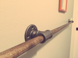
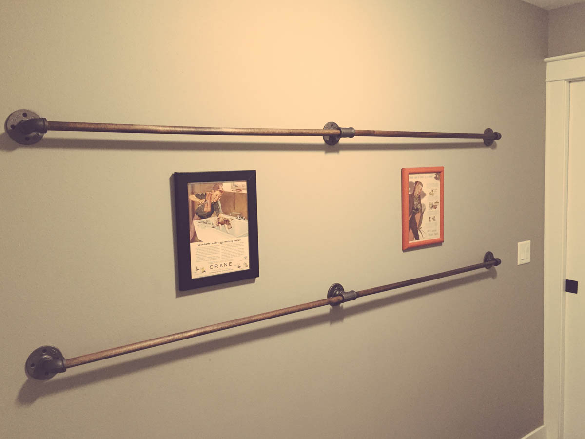
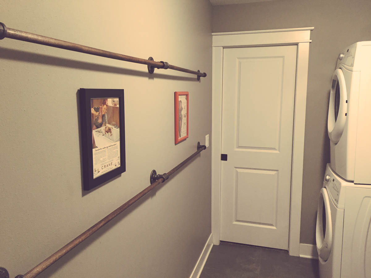
DIY Wall Mounted Industrial Drying Racks
We moved into a new house a little over a year ago and have been slowly making the house work for us. Its been fascinating and frustrating to acclimate to new surroundings, new processes, and new spaces.
One of the things we've been trying to get used to is our laundry/mud room. We really prefer to hang our laundry and have it air-dry rather than use the actual electric dryer. Not only does it save money on energy and supplies, but clothes don't shrink and there is less wear and tear.
Space however is an issue. We have two fairly large wooden drying racks that take up the majority of the space in the room. That wouldn't be too much of an issue but the room is also used as a hallway from our closet and it is the only connection to the garage so we need to keep the space clean.
I've racked my brain the past year to come up with a solution and have had some crazy ideas including one that would have wooden poles come out of the walls and flip down from the ceiling.
But sometimes the most elegant and workable solutions are also the simplest.
This was such a ridiculously easy build I really can't believe I didn't come up with it earlier.
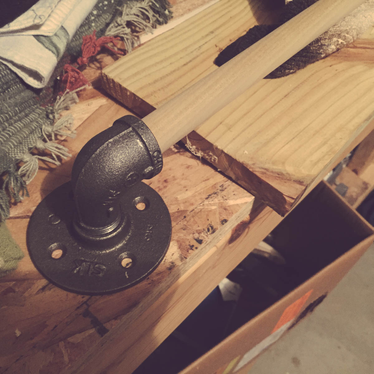
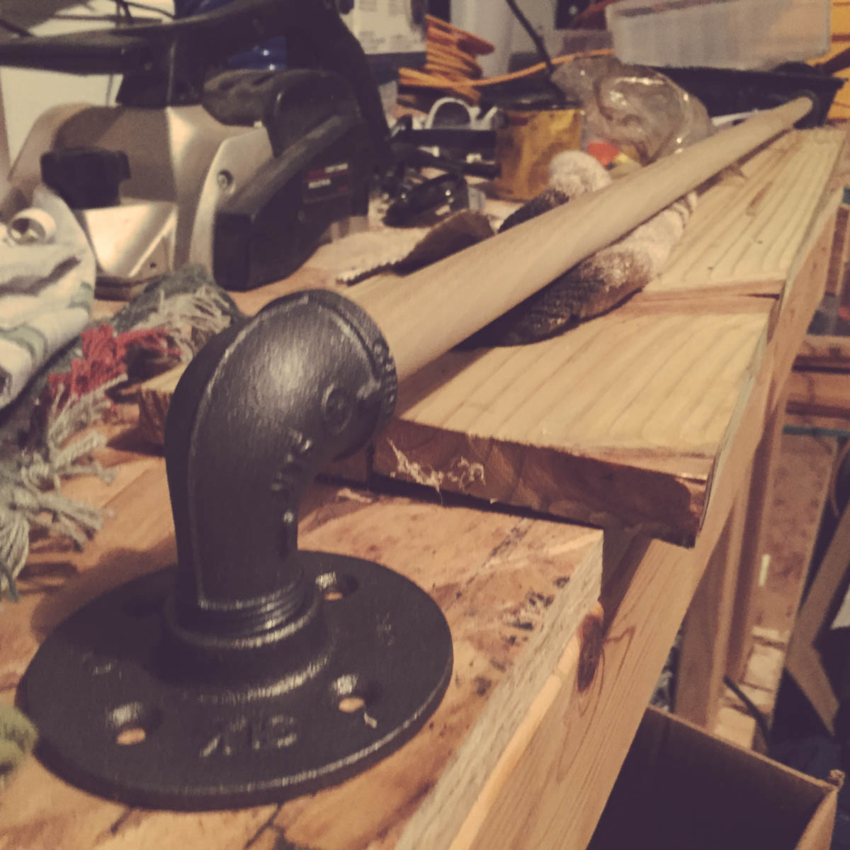
Supplies
The quantities below made three racks about 8' long. The links are to Menards (a midwest chain) and the exact products I used.
- 3/4" Black Floor Flange (9) – $4.67/each
- 3/4" Black 90 degree Street Elbow (6) – $1.59/each
- 3/4" Black Tee (3) – $1.46/each
- 5/8" x 48" Poplar Dowel (6) – $1.49/each
Installation
I wasn't sure how long the dowels would need to be until I had the flanges in place so the first task was to figure out placement.
I needed to strike a balance of the racks looking nice on the wall while putting as many flanges as possible in studs. So I found studs on either end and of the wall and decided that is how long the racks would be.
You're particular setup will determine how long or short your want the racks to be.
I screwed the first flange into the stud behind the wall on the right end. I then used a laser level to make sure I was at the correct height on the left end and screwed in the other flange.
I then measured to find the half-way point between the two flanges and using heavy duty drywall anchors screwed in the middle flange.
Screw in the street corner elbows on both ends and the tee in the middle and you can measure to find how long you need to cut your dowels. I used two dowels per rack. It was easiest to install two short rather than one long.
Finishing
Once I had the dowels cut, I sanded and stained them. I also found that using the flanges and elbows was a pretty good way to hold the dowel while staining and drying.
Total Cost of the project was about $65.
They've worked great, look good and have re-gained some much needed space in our laundry room.
These photos below (click to enlarge) only show two racks but I did install a third later on below.


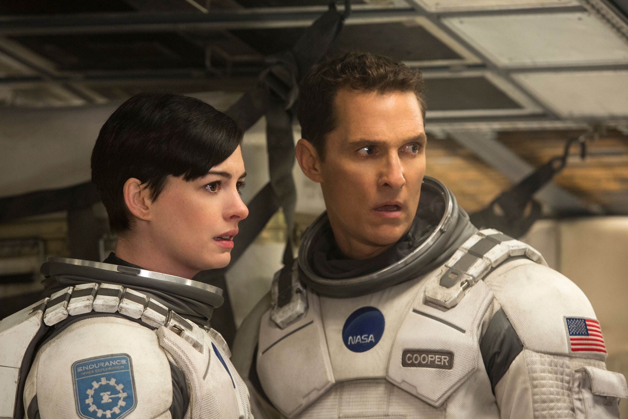
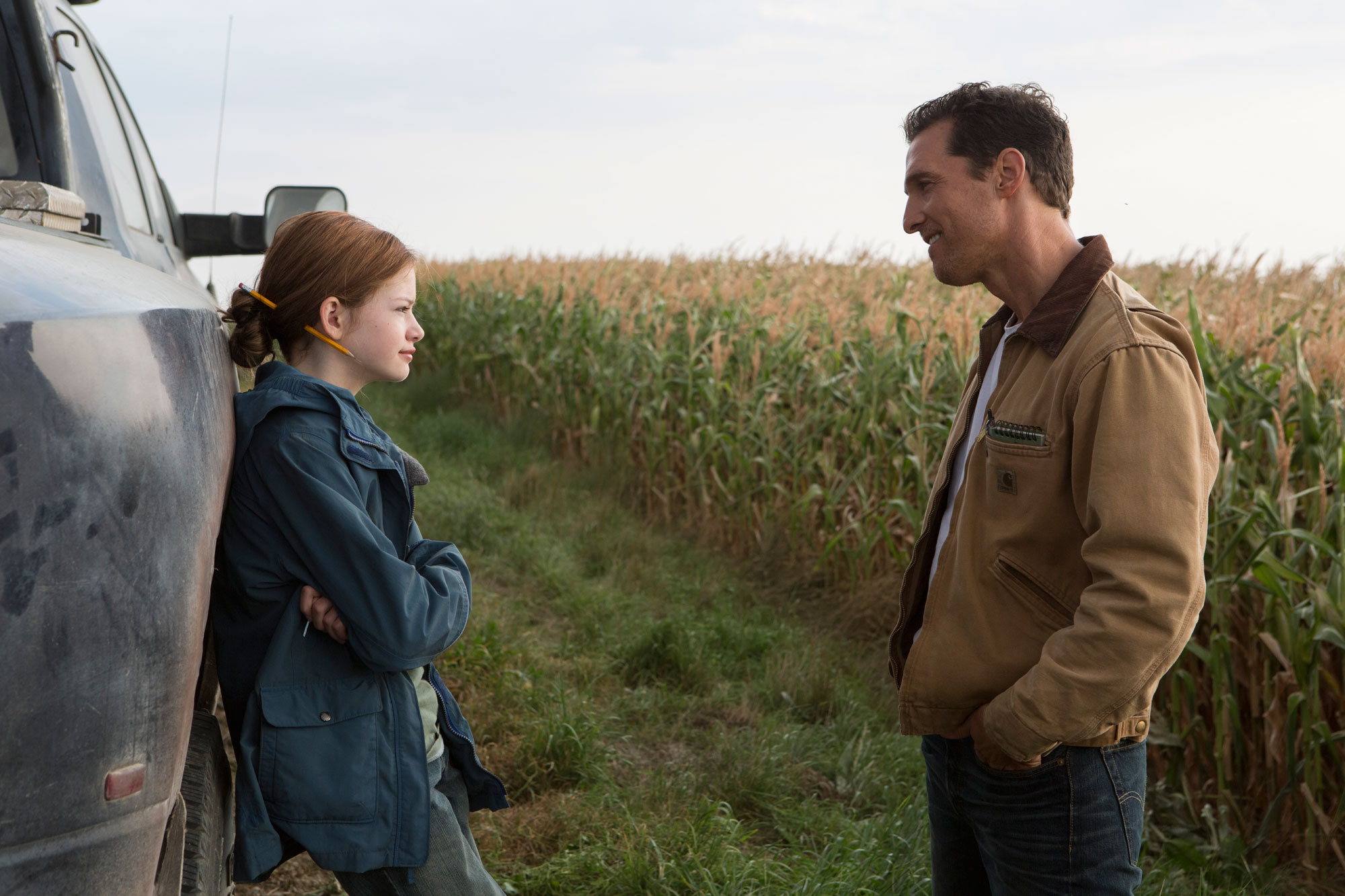
What Year Does Interstellar Take Place?
Definitive answers to the questions, “What year does the film Interstellar take place, and when did Cooper and Endurance leave earth?”
The filmmakers most likely didn’t intend for the timeline to be deconstructed like this, but they should know better :)
Update: I’ve included other clues and information from Kip Thorne’s book The Science of Interstellar, and the official novelization of the film. There are however, some weird contradictions between the novelization and the film.
I’ve only found one specific date in all the official or semi-official literature available and that is the year 2019. Kip Thorne says this was when Professor Brand discovered the wormhole. Its not in the official script, but Thorne did write the initial treatment so its as good as any data we have.
The Interstellar Timeline
2000 – Donald is born
Donald states he was a kid when there were 6 billion people on earth. The last year this was possible was 2011. Being a “kid” to an older man normally means somewhere in the age of 5-18. So theoretically Donald could have been born anywhere from 1993-2006. This also matches up with his statement about “new gadgets coming out all the time.”
The Yankees (who are featured in the film) won the World Series in 2000 and it sounds like a great round number to start from.
Note that this date is not critical to figuring out the timeline, its just a fun throw in.
2017 – Gravitational anomalies are detected
In the conference room in 2067 it is stated that NASA detected these anomalies almost 50 years ago.
Kip Thorne also says in his book that Professor Brand went back through the data two years before the wormhole discovery and found other gravitational anomalies.
2019 – The wormhole appears
In Kip Thorne’s book The Science of Interstellar he imagines that Professor Brand and LIGO discover the wormhole in 2019. While not an “official” source, Kip did write the initial treatment of the script and this is the only specific date I’ve found in any related source. So this year is the best we have to go with and will be the year on which all other data is based.
In the conference room in 2067 it is stated that NASA saw the wormhole 48 years ago.
2025 – Erin is born
According to Google, the average age for someone to have their first child in the US is 25. So we’ll say that Donald had his daughter in the year 2025. The novelization says her name is Erin. It also tells us that she was an only child.
2031 – Coop is born
The novel and the film seem to indicate that Coop is in his 40’s when he leaves earth like when Donald tells him he was born 40 yrs too early or 40 yrs too late, or when the novel suggests that at the age of 124, 80 odd years had passed since Coop left earth.
This age range also matches up with an article where Christopher Nolan and Matthew McConaughey “talked about who we are as 43-year-old men, talked about who we are as [fathers], talked about our kids.” Their protagonist would seem to be in the age range of 40-45.
But it just isn’t mathematically possible given the facts we know about Murph’s age at the beginning, Murph and Cooper’s age being the same in the middle and Cooper’s age at the end. Coop has to be at most 36 years old when Endurance launches.
So for now, I’m ignoring the indications and going with the “facts.”
2052 – Tom is born
If we keep to about the same average of the first child being born, and assume Tom was their first child, while also factoring in Kip Thorne’s date about the wormhole discovery, Donald’s daughter Erin, had Tom in the year 2052.
2057 – Murph is born and the Lazarus missions launch
We know Tom is five years older than Murph so If we calculate that Tom was born in 2052 Murph will be born in 2057.
The Lazarus missions were sent out 10 years before Coop and endurance leave earth, according to Dr. Brand’s explanation.
Its also fitting that the year the missions launch to save earth, the earth’s eventual savior is born.
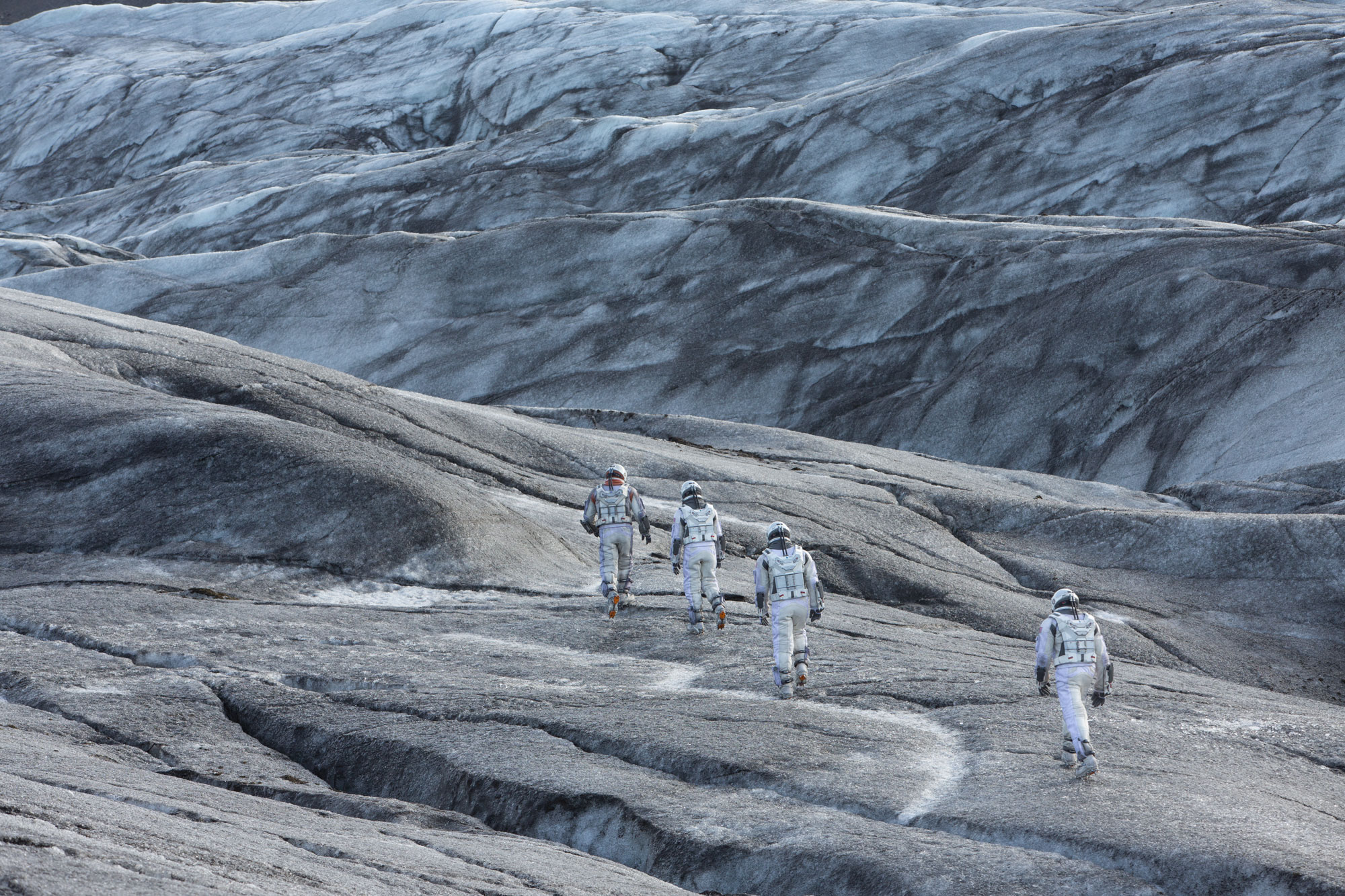
2067, April 18th – The Endurance leaves Earth
We know Tom was 15 when Cooper left earth so we just add 15 years to Tom’s birth. We can also calculate this date by adding 48 years to the date of the wormhole discovery.
And if you want to get really specific…in the film an older man from the future documentary states that the huge dust storm at the baseball game happened on April 15. Coop and Murph find NASA the next night on April 16 and then spend the night there into the 17th. Coop and Donald talk that evening on the porch and then the next morning Coop leaves.
The novelization says this differently and has it occurring on May 14th. Apparently it wasn’t “clear as a bell…”
2069 – Endurance reaches Saturn/Wormhole in February
8 months to Mars, 14 months to Saturn
2069 – Endurance reaches Miller’s planet
After being on Miller’s planet Brand says she hasn’t seen Edmunds in a decade. Assuming she isn’t counting the two years she spent in cryo-sleep we can infer that it took less than a year to get to Miller’s planet. Additionally, after they come out of the wormhole the crew remarks that they are coming up on Miller’s planet fast. So I’m guessing maybe it took them only several months (if that) to get there.
Kip Thorne also confirms this by telling us that the crew entered into the galaxy very near to Gargantua.
2092 – Coop and Brand come back from Miller’s planet.
They spent a total of 3 hours and 20 minutes on Miller’s planet while 23 years 4 months pass on earth.
The movie doesn’t seem to indicate this as Case says it will take 45 to an hour to drain the engines. The pacing of the film also suggests they don’t spend that much time down there (and I know, that’s kinda the point), but in order to have 23 years 4 months pass on earth (using the ratio of 1 hour on Miller’s planet equaling 7 years on earth) they have to have spent 3.3 hours on Miller’s planet. Maybe they bounced around on the wave longer, or after the engines were sparked they had to come down again. The novelization seems to confirm that they did ride the wave for awhile.
Murph is now 35/36 years old. She was 10 when Coop left. Two years to Saturn, maybe several months to Miller’s planet and 23 years 4 months later.
In her birthday message she says she is the same age now as when her father left. According to my timeline that would put Coop’s birthday in 2031.
Again the film and novel suggest both are in their 40’s (the novel specifically says when Coop is 124 that 80 odd years have passed since he left earth) but unless there’s something I’m missing, this isn’t possible given the facts surrounding Murph’s age.
The film is also very careful to specifically state that Murph was upset because they were the same age and it was her birthday. There is a lot of detail there so it makes it hard to fudge and say they were in their 40’s.
2093 – Endurance reaches Mann’s planet
There has to be at least several months travel. Right before they were coming up on Miller’s planet Doyle tells the group it is months to Mann’s and Edmunds is even further. The way Doyle says it indicates that its more than a few so probably 6-9 which would probably take them into another calendar year.
Kip Thorne also confirms this.
2093-2100 – Endurance leaves Mann’s planet
This is where things get tricky. We are told at the end of the film and novel that Coop is 124. Specifically 51 of that is spent in time slippage in Gargantua. In order for the math to work at the end with Coop being 124, and pushing 120 after the slingshot, and still being the same age as Murph when he left, we have to account for some missing time.
We’re missing about 7 years. There is some outside evidence for this passage of time on earth. Tom and Lois apparently have another son in this time that appears to be 6-10 years old. The novel confirms that he is six years old though I think in the film he looks more like ten. Also Dr. Brand (Michael Caine) ages and dies.
The timeline and relative events are also pretty concrete up to this point. There really isn’t any wiggle room to add in years before based on the facts we know.
We can says with a fair amount of certainty that it can’t be time slippage on Mann’s planet because the novel says specifically that Mann’s planet is outside the time slippage zone and in the film Endurance was able to be pretty close to Miller’s planet , right on the cusp of where time dilation occurs, and not be affected.
Kip Thorne estimates they were on Mann’s planet only 40 days. He says this because when Cooper rescues the Endurance they are very close to Gargantua. Thorne says this possible if Mann’s plant has an egg shaped orbit that brings the trajectory of the planet close to Gargantua.
So, I’m not sure what to make of this. To make the years work with what we know at the end of the film it seems that we’re missing 7 or so years. Maybe they spent an extra hour on Miller’s planet and didn’t realize it…
Jonathan Nolan, if you ever read this please contact me and let me know :)
2151 – Endurance slingshots around Gargantua
Coop remarks “This maneuver is going to cost us 51 years.” Amelia also remarks that Cooper looks pretty good for pushing 120. This matches up with the birthdate of 2031 for Cooper (give or take a few months).
2156 – Coop wakes up on Cooper Station at the age of 124
Coop is no “spring chicken” and has spent five additional earth years somewhere. Its most likely not in the Tesseract as that is in the bulk – outside of space and time. Our options appear to be:
- He encountered more time slippage
- There is actual time in the Tesseract and that was used to transmit the morse quantum data
- He was in a coma after reaching Cooper Station.
I like the idea of more time slippage. Commenter Minna Aalto pointed out that there most likely would have been additional time slippage as Cooper passed the event horizon.
Murph now would be 99/100 years old. This would make sense if she and Getty get together and start a family. She tells us she has grandkids and there are some middle aged looking people in that hospital room said to be family. According to our earlier conclusions those generations would span 50-70 years. Add that to her late 30’s when she solves the equation and it is plausible.
2157 – Coop reaches Brand on Edmunds planet and they live happily ever after.
Okay, I added that one in. But like most Nolan films he makes you think up your own ending.
I would love to hear other theories and please correct my math/facts.

Interstellar Explained
Interstellar is a film that absolutely captured my imagination. I've been thinking about this movie and trying to answer the questions it posed for a few months now.
I've read a number of articles and explanations online since its release, but none have really answered everything for me. So, I was fairly excited when I saw it show up on my Apple TV last Tuesday and I was able to watch it again.
Now, watching it the first time on an IMAX screen was truly transcending. This was a movie that IMAX was made for. It was beautiful both in look and sound. And while I wasn't able to replicate that experience at home I was able to pause, go back and re-watch several key scenes that unlocked this film for me.
FYI - major spoilers ahead. But seriously, why are you reading an article titled "Interstellar Explained" when you haven't even seen the film?
What is the Message of the Film?
When trying to answer questions about weird scenes, plot holes, the motivations of characters or why the director did this or that, you have to understand the overall context in which they live. You have to understand the themes and messages presented in the story.
One of the main themes the film explores is the power of love. It does this by examining a number of relationships including Cooper's relationship with his children, Amelia's relationship to Edmunds, the astronauts relationships between themselves, and humanity's relationship with itself.
That last one, I believe, is the key to unlocking the entire movie. Humanity wants to save itself. Self-preservation like love and gravity seem to be able to transcend time and space.
Sequence of Events
So, first we need to understand the basic plot of the story. Here is my bullet point snap shot of the whole thing.
- Earth is dying.
- Humanity comes up with two plans to save itself.
- Plan A will save the actual people on earth and transport them to a new planet.
- Plan B will colonize a new planet with test-tube humans.
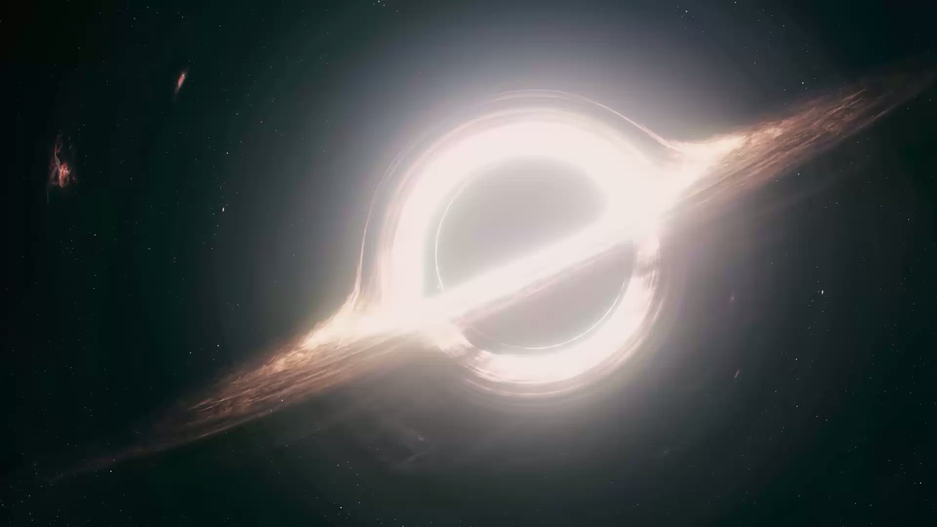
- Both plans are plausible because of recent discoveries of gravitational anomalies and the appearance of a wormhole near Saturn.
- Twelve astronauts are sent through the wormhole to find new planets capable of sustaining humanity.
- At least three of those astronauts, which are fairly close to each other, ping back positive information.
- Four new astronauts are then sent to discover the best option.
- The first two planets they explored didn't work out. Enter evil Matt Damon.
- Everyone discovers that the government never thought Plan A was possible. Bummer. Everyone on earth is probably going to die.
- Because of resources used up in exploring the first two planets the new astronauts can either go back to earth or try out the last planet and implement Plan B.
- They decide to implement Plan B.
- In a hail-mary attempt they also decide to send a robot (Tars) into the black hole to try and solve the equation that would actually make Plan A still a possibility.
- Cooper realizes that their ship is too heavy and won't make it out of the black hole's gravity unless they shed some weight.
- He sacrifices himself and is sucked into the black hole along with Tars
- Instead of being sucked all the way in the black hole they end up in a weird construct of bookshelves. (More on this in a minute.)
- Tars can't transmit the data out of the black hole.
- Cooper is able to transmit the data back in time to his daughter using gravity.
- Murph uses the data and is able to get Plan A set in motion.
- Cooper is transported via wormhole out of the bookshelf construct back to near Saturn.
- Cooper reunites with his daughter who encourages him to finish the mission and reunite with Brand.
- Amelia Brand reaches Edmunds planet and starts the new human colony.
- Cooper sets off to find Brand.
- Roll credits and really cool Hans Zimmer score.
Love and gravity are the answer
So let's go a little deeper and get some answers.
What is up with crazy spaced out library?
The actual name for this construct is a "tesseract." This is kind of confusing if your only knowledge of that term (like mine) is that of the Avenger's tesseract and you're expecting some blue powerful glowing thing. In reality its a four dimensional analog of a cube that seems to go on forever.
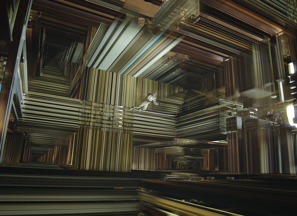
Cooper and Tars pretty much explain everything about this place while they're in it.
Future humanity has constructed it specifically for Cooper. I believe they know he is the key to saving humanity. That leads to a couple questions we need to address.
If future humanity is knowledgable enough to construct wormholes and a time machine that lets you see and touch the past, why can't they just either send the correct info back themselves?
Even all-powerful future humans have limitations. They face the same problems our heroes face. Namely, space and time.
I believe the main antagonist in the film is not an actual character but time and space itself. Throughout the film the characters are trying to figure out how to eclipse the barriers put in their way by time and space.
- Time is running out for the people of earth
- The only options available are thousands of lightyears away
- The immense space limits communications
- The time slippage destroys relationships
- The physical space between Edmunds and Brand is devastating
- Future humanity can't connect with past humanity because of time
The only way for future humans to connect is to find something that transcends space and time. In the film we learn that there are two such things, gravity and love.
Future humans can use gravity to point the way as they did with the initial anomalies, the wormhole and the tesseract, but ultimately it is love that pulls present humanity to their salvation.
In a pivotal moment in the film Amelia says to Cooper:
data-animation-override>
“Love isn’t something we invented - it’s observable, powerful. Why shouldn’t it mean something?I’m drawn across the universe to someone I haven’t seen for a decade, who I know is probably dead. Love is the one thing we’re capable of perceiving that transcends dimensions of time and space.”
Cooper love for his daughter was they key. It was because of his love for her he kept trying. It was because of his love for her that she came back to the house. And it was because of the bond they shared that he knew she would find the watch and knew it meant something.
Love and gravity transcended time and space and was the medium future and present humanity used to save itself.
That then leads to the second question.
The B-theory of Time
How can future humanity provide the means to save present humanity? If present humanity doesn't have the way, future humanity wouldn't exist to send it to them.
We have ourselves a good old fashioned paradox. Well, we do if you subscribe to the A-Theory of time.
If you go with the B-theory of time, like Kip Thorne, an astrophysicist and executive producer of the film, then there is no paradox.
Early on the film gives us a clue to its position concerning time when Cooper is explaining to Murph about her name and its relation to Murphy's law.
data-animation-override>
“It means that whatever can happen, will happen.”
That is a fairly deterministic view of time and fits in perfectly with the B-theory of time which states that time is an illusion. The past, present and future are equally real, and that time is tenseless. This would mean that temporal becoming is not an objective feature of reality.
This is further illustrated inside the Tesseract where Cooper can see and interact with seemingly every point in time in that room. All are equally real and all are happening.
To better understand this, think of all moments throughout the history of the universe like inch marks on a yardstick. If you were able to step back and view the whole yardstick you would see that all the inch marks exist at the same time. The B-theory of time says that these inch marks are slices of "time."
In this view there was never a reality in which humanity did not save itself. The wormhole was always placed. Cooper always sacrificed himself to save Brand and he interacted with the Tesseract to send the message back to Murph.
It kind of takes the drama out of it, which is why it probably wasn't explicitly stated that way in the film.
The Ending
When Cooper is dragged into the Tesseract he doesn't know all of this at first. Before he realizes where he is he thinks that it has all been for nothing and realizing what he lost he implores Murph to get him to STAY.
Its only after Cooper realizes his "purpose" that he then sends the coordinates to NASA and then ultimately sends the black hole data to Murph.
These events are sequenced differently in the beginning of the film which leads to some confusion but actually illustrates that Cooper is operating under the B-theory of time as he can access any point in that bedroom.
From there I conjecture that Tesseract was also connected with the original wormhole as Cooper ends up outside of Saturn.
One thing that doesn't make quite sense is why Cooper would leave his family to continue to chase the mission. His daughter and what appears tons of grandchildren and great-grandchildren are present with them in the hospital. After all the time the film spent on the power of love and getting back to family it seems an odd choice for Cooper to leave again so quickly.
Conclusion
I think Interstellar was a wonderful film and I plan to write more about it. I believe there are some rich theological truths we can glean even though the film takes a very naturalistic position. We'll explore those in the future.
For now, allow it to excite your imagination and wonder at the beauty of creation
Link Roundup for February 20th
As always, here are few things I found interesting as well as some funny tweets.
Behind the Scenes of the Lego Movie
Read and see how the creators of the Lego Movie were able to make it look like real Legos. In fact if you wanted to, you really could build the entire movie.
Why Diners are More Important Than Ever
Great article that talks about the importance of using food and locations to connect with others. Its a good reminder for Christians to be in the culture and celebrating with others.
Has Visual Design Fallen Flat?
Flat design (a reductive but useful shorthand) didn’t just kill skeuomorphism (ditto), it danced on its grave and then erased every last trace of beveling, shadow, and granite texture from the headstone. So, what's next?
Stock Photos that Don't Suck
I'm always looking for good stock photos. Most of the time I try and take my own, but when time constrains you here are some great options that don't have the cheesy stock photo look - e.g. - some person smiling wearing a headset while sitting at the cleanest desk known to man.
.lego {
display: block;
}
— Jonathan Malm (@jonathanmalm) February 18, 2015
I find it shocking that people still send me Candy Crush invitations. How much longer, Lord??
— JenHatmaker (@JenHatmaker) February 10, 2015
Does anyone know if the President saw his shadow today?
— THE @Kathy_L (@Kathy_L) February 16, 2015
A snow day is a great opportunity to decide which family member you'd feed to the wolves first.
#butseriously
— Danny Franks (@LetMeBeFranks) February 18, 2015
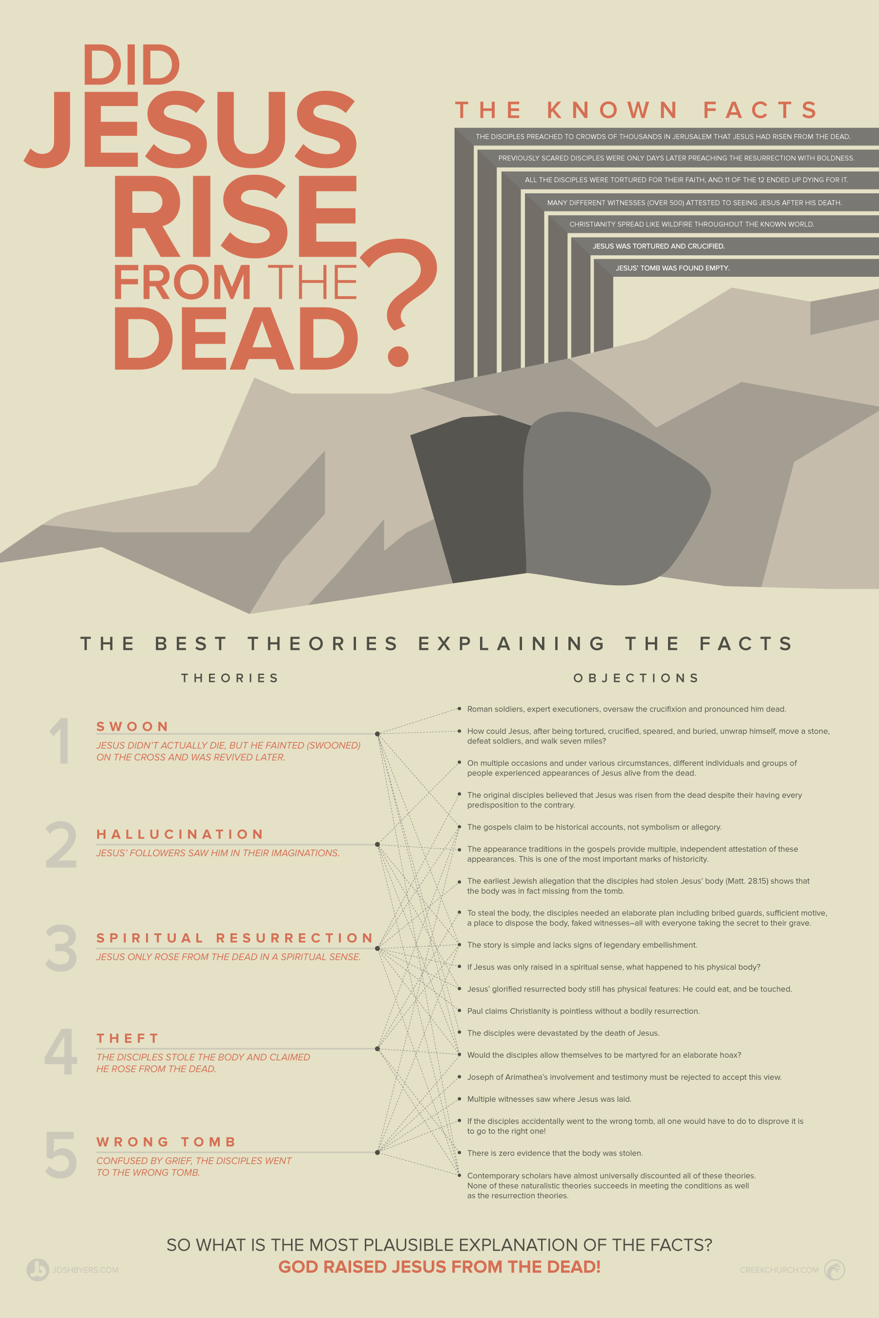
Did Jesus Rise From the Dead? [Infographic]
One thing that could destroy Christianity would be to prove that the resurrection of Jesus was not true.
The Apostle Paul says so in 1st Corinthians 15:14. If the resurrection were not true, we would be the most foolish of people to continue believing what we believe and living how we live.
However, I believe that the resurrection of Jesus really did happen. And while faith is always a key component to following God, my faith is not an unreasonable one. I want to know that the things I believe aren't just myths. I want to ask the hard questions. I don't want to blindly follow claims.
When it comes to the resurrection we ask hard questions and learn the facts. Once we know the facts we can draw very plausible conclusions based on these known facts. To simplify this process and to present it visually, my colleague Zach Dietrich and I, came up with the infographic asking and answering the question: Did Jesus rise from the dead?
[Note that nearly all of contemporary scholarship, believer and skeptic alike, attest that the known facts are true.]
Enjoy.
New Stock Photos
I have uploaded more free church stock photos for you to download.
All photos are in a 16x9 format and are high resolution up to 5k. Click through on the pics to the download page.

Communion tray with candles in background.
Person with Bible open on lap during service.
Link Roundup For January 30
Here it is! The weekly dose of stuff I found fun and interesting.
Story City Church Promo Video
I'm always on the lookout for well done church videos. This is a fun one that talks about the launch of a church plant.
Man builds the world’s first 3D printed concrete castle in his own backyard
This is the future. No more refrigerator boxes for play houses.
InVision - A Prototyping & Workflow Platform
Hey Designers, this looks like a great tool for sharing and collaboration.
Build a Lighted Chalkboard Sign
From the DIY camp, this looks like a fun project that could turn out really cool.
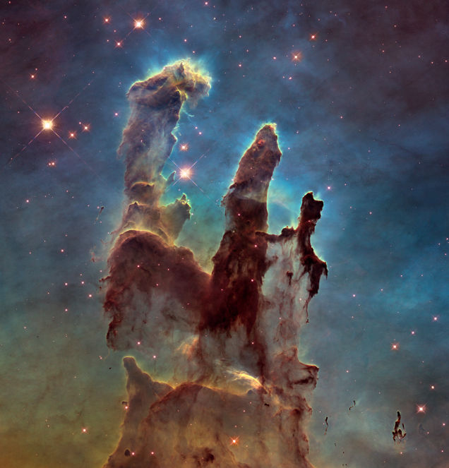
It may sound incredible but the Pillars of Creation don't exist anymore [maybe]
Time, space and theology make my brain explode.