Iron Man Papercraft Birthday Invitations

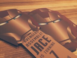
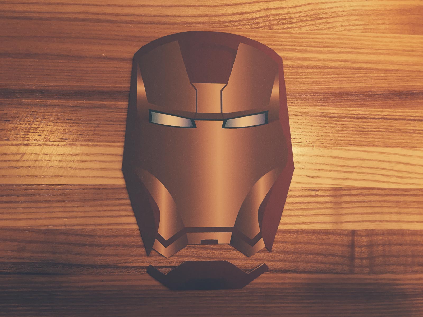
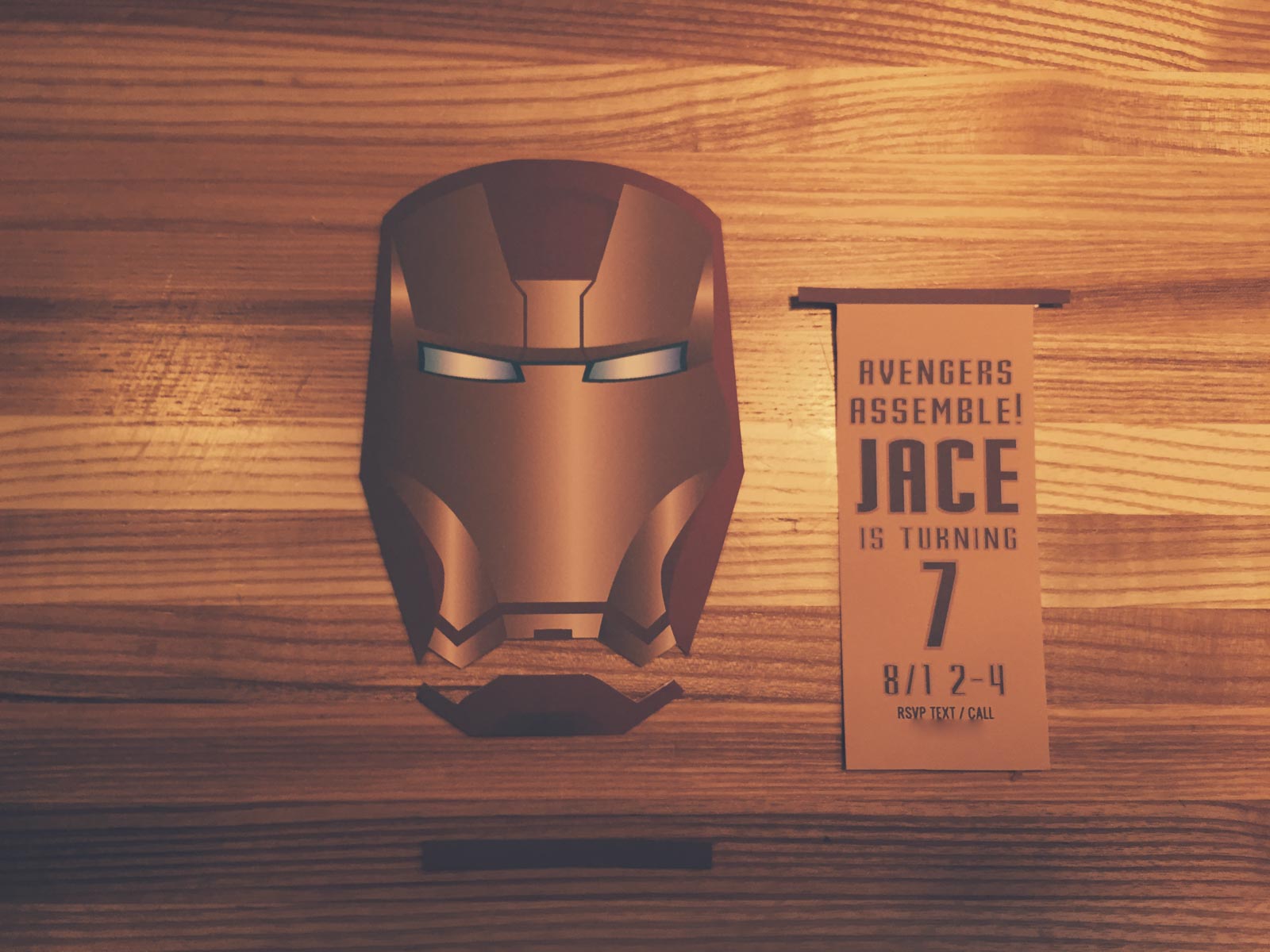
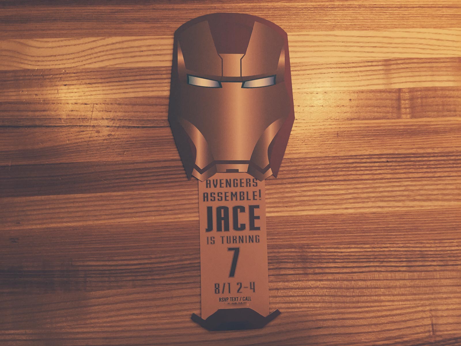
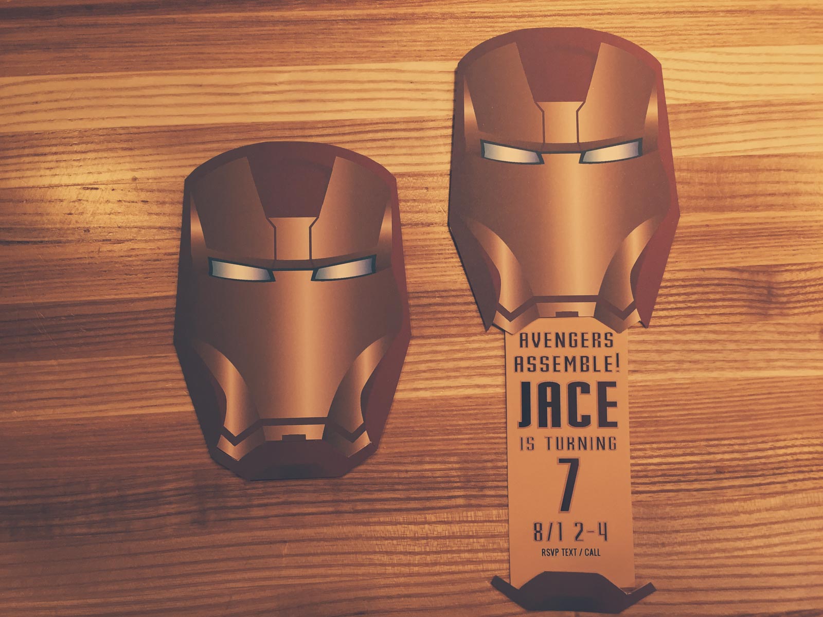
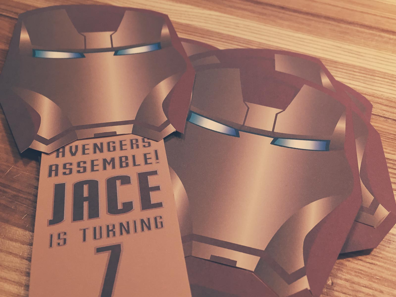
My son turned seven recently and wanted and Avengers themed party. First off were the invitations. I decided to create an Iron Man mask where the mouth slid down to reveal the party details.
This is super simple to make. It only requires a printer, scissors and a glue stick.
- Download both the mask and slider pdfs.
- Open the invite details pdf and fill in the form with your specific details. If you want to match the font you can download the free font Stark from DaFont. There are form fields for your child's name, child's age and rsvp phone number. If your child's name is too large you can adjust the size of the field by right clicking the field and choosing "properties."
- Print out as many invites as you need.
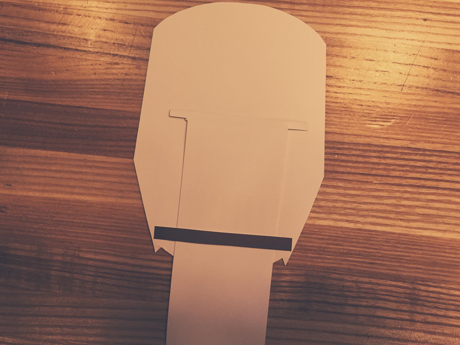
- Cut out the mask and both slider pieces.
- Cut off the bottom part of the mask as you see in the first image. You'll be attaching this to the bottom of the slider piece in a moment.
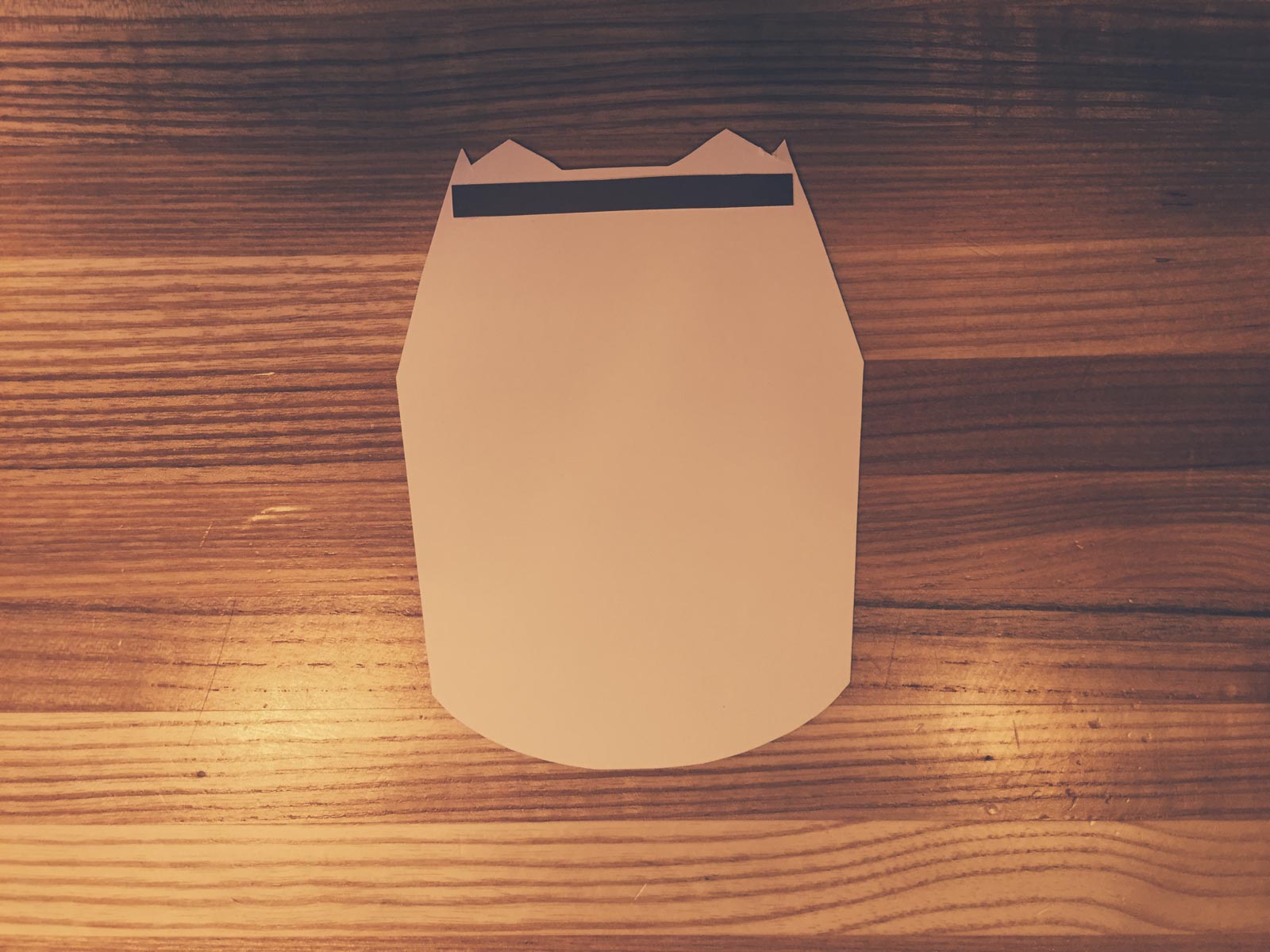
- Glue the single piece from the slider to the back of the mask near the bottom. You'll only want to put glue near the left and right edges. The slider needs to be able to slide in freely.
- Put the slider in the mask and glue the bottom part of the mask on.
- Enjoy!
Top Ten 2015/16 Premiere League Jerseys Ranked
What are the best kits for the 2015/16 season of the English Premiere League?
Here are the criteria to be considered.
Stripes or No Stripes?
If a jersey has vertical stripes it automatically goes to the bottom of the pile. The only thing they're good for is spotting a Newcastle Fan from 100 yards so you can steer clear.
Color Combinations
Does the jersey have a awesomely sick combination of electric blue and black or a disgustingly sick combo of green, yellow, and orange?
Likability of Team Wearing Them
Don't care how cool your jersey is if you're a jerk in it.
Is it Arsenal?
Always classy and near the top, are the Gunners. My favorite team gets a special bonus.
Team Logo/Crest
Does it fit in well on the jersey? Does it include ridiculous hard to read type?
Sponsor Coolness
Do I want to be a shill for wonga.com or bet365? Nope.
Sponsor Logo
Does it fit the jersey or does it look like a 3rd grader took a glue stick and slapped a giant piece of paper on it?
Manufacturer
Who made this thing? Who gets the credit? Who is to blame?
Bonus
Some kits and teams deserve special recognition. Others deserve a kick in the pants.
THE BEST OF THE BEST
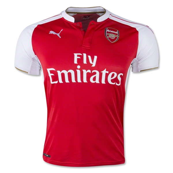
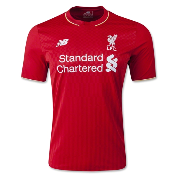
1. Arsenal Home
Vertical Stripes: 5
Nope.
Color Combination: 5
Classy combo of red and white is hard to beat.
Likability of Team: 5
Is It Arsenal: 5
Yes. Hey, a homer has to get in extra points somewhere right?
Team Logo/Crest: 5
How can you not like a logo that is simply a gun? Point for simplicity and coolness.
Sponsor Coolness: 3
Apparently its a nice airline, and I would much rather rep an airline than a gambling site but it is also a pushy sponsor. They couldn’t just say “Emirates” they have command me to sit on their plane.
Sponsor Logo: 3
Its not bad. The all text works on top of just about any design.
Manufacturer: 4
Puma has a coolness factor right now though I don’t like that they slap it on the jersey 3 times.
Total: 38
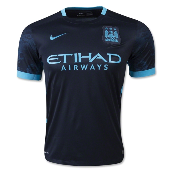
2. Manchester City Away
Vertical Stripes: 5
No.
Color Combination: 5
Electric blue on navy with some subtle prints on the sleeves? Yes please. This is striking. By far the best color combo in the league this year.
Likability of Team: 2
Still don’t like them, but they get points for finishing below Arsenal last season.
Is It Arsenal: 0
No.
Team Logo/Crest: 5
The eagle in electric blue is possibly more cool than Justin Timberlake in a tux.
Sponsor Coolness: 3
Any national airline of a place that builds palm tree islands just because is pretty cool.
Sponsor Logo: 4
I like to say Etihad. Say it with me. Etihad. That’s nice.
Manufacturer: 5
That swoosh couldn’t look any better on a uniform.
Bonus: 5
This is an amazing kit. If I was picking a team to follow based solely on its kit. I would pick Man City no doubt.
Total: 34
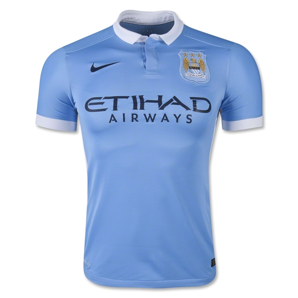
3. Manchester City Home
Vertical Stripes: 5
None here.
Color Combination: 4
Powder blue, navy blue with a dash of gold thrown in is pretty sweet.
Likability of Team: 2
It is a requirement to dislike teams bought by rich people who use them as their plaything.
Is It Arsenal: 0
No.
Team Logo/Crest: 5
Gotta give credit where credit is due. This is an awesome crest. As American’s know, the eagle is the warbird who makes all dreams come true. Slap an eagle on something and it instantly is more intimidating, cool, and ready to open a can.
Sponsor Coolness: 3
Airlines are fun because they take you places, like out of Manchester! I’m here all night folks!
Sponsor Logo: 4
Its simple and mysterious. Has a razor sharp feel that says precision.
Manufacturer: 5
The Nike swoosh is the pinnacle of manufacturer logos.
Bonus: 2
I like that Nike understands they don’t need to slap their logo on the shoulders. They know one is powerful and enough.
Total: 30
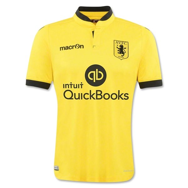
4. Aston Villa Away
Vertical Stripes: 5
There are none
Color Combination: 5
Simply awesome. This is a jersey I would buy because it looks cool.
Likability of Team: 3
Meh. Not much to like or hate.
Is It Arsenal: 0
Aston Villa is in fact not Arsenal.
Team Logo/Crest: 5
Classy, simple and cool. Fantastic choice to go all black.
Sponsor Coolness: 2
I’ve used quickbooks and there is nothing cool about it.
Sponsor Logo: 2
The “qb” is actually pretty good. If it were only that you would have an amazing sponsor logo. Even adding in “Quickbooks” isn’t all bad, but adding in the off center “intuit” ruins everything.
Manufacturer: 2
Nothing says relegation bound like the jersey manufacturers of Millwall FC. Who? Exactly.
Bonus: 5
I liked this kit so much I invented the bonus category because of it.
Total: 29
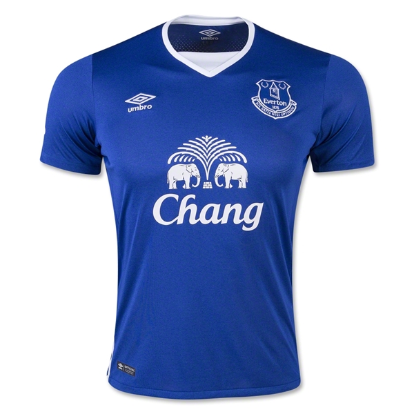
5. Everton Home
Vertical Stripes: 5
None appear on this kit.
Color Combination: 3
Simplicity will always work well on just about any kit. Its a little boring but I would rather have a little boring than eye-gouging green, orange and yellow.
Likability of Team: 4
Everton seems to be America’s default EPL team. They’ve had a number of high profile American players including Tim Howard, Brian McBride, and Landon Donavan. They are also a perennial underdog.
Is It Arsenal: 0
No.
Team Logo/Crest: 3
Not bad. Its a typical European crest. Tons of symbolism and small letters. Not great, not terrible.
Sponsor Coolness: 4
Beer and football seem to go together. Also, after the tsunami of 2004 hit Thailand, Everton and Chang donated so much money to an affected region they renamed it Everton-Chang. That’s pretty cool.
Sponsor Logo: 3
For an Asian sponsor, this logo is near the top. Still looks odd on an English football jersey but its okay. Points for all white and nice symmetry.
Manufacturer: 4
Classic and simple. Umbro is soccer.
Bonus: 2
Tim Howard, the bearded wall plays for this team.
Total: 28
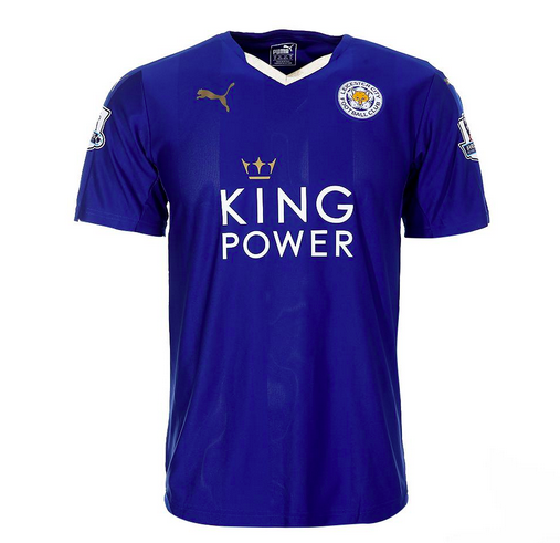
6. Leicester City Home
Vertical Stripes: 5
hey went smartly vertical stripe free.
Color Combination: 4
The royal blue and gold always work well. The subtle gradients also look nice in contrast to Puma’s other away kits with argyle gradients that look horrid.
Likability of Team: 3
Meh. Their highest ever finish in the top flight of English football was second…back in 1928. Not much to see here.
Is It Arsenal: 0
No.
Team Logo/Crest: 3
It couldn’t be more English. As Leicestershire is known for fox hunting the fox was the natural choice for a mascot. It is simple enough and gladly doesn’t have a fierce “I’m going to kill you” look most American animal logos have.
Sponsor Coolness: 3
King Power is a travel retailer. They lose points for contributing to absurdly high airport prices but gain points for having mysteriously cool duty free shops. I always feel like a secret agent when I see one and want to browse like I'm up to something.
Sponsor Logo: 4
Thai logos seem to work well for a Western Audience. King Power recently revamped their logo and this version works very well on Leicester City’s kits.
Manufacturer: 4
Puma is simple and small. Not bad.
Bonus: 2
The crown on the revamped logo is splendid.
Total: 28
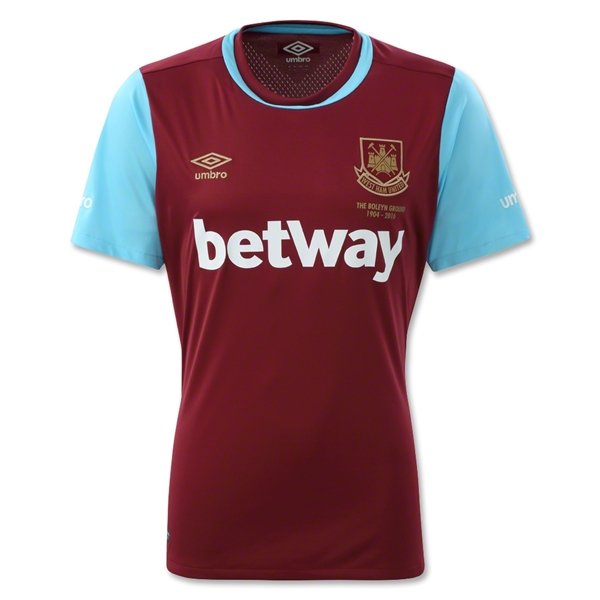
7. West Ham United Home
Vertical Stripes: 5
There is a stripe but it is not vertical.
Color Combination: 4
These look a lot better in live action then they do by themselves. The maroon and powder blue work.
Likability of Team: 3
They would have gotten a four but they beat Arsenal yesterday and I’m a little bitter. My cousin and friend like this team and I like them so West Ham is a winner. Plus their nickname is the Hammers. That’s pretty cool.
Is It Arsenal: 0
No.
Team Logo/Crest: 4
The English love their castles. And they should. Castles are fun. Add in a couple hammers, some crosses and you’ve got a really well done crest.
Sponsor Coolness: 1
Can’t get on board with gambling sites. I also keep thinking it says Beltway and that’s weird.
Sponsor Logo: 4
Props for single color, all text. Looks nice, even though I still think it says Beltway.
Manufacturer: 4
Umbro again, is classic soccer to me.
Bonus: 2
They have two home kits this year - one normal and one to represent the final year at their stadium. It is also well done and not crazy like some teams might go for.
Total: 27
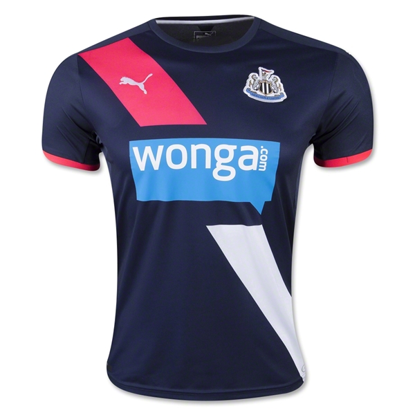
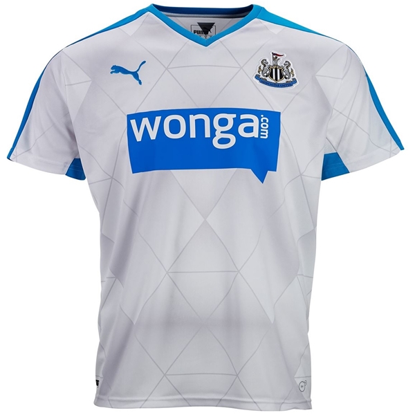
8. Newcastle United 3rd
No Vertical Stripes: 5
Color Combination: 4
They’re stuck with the sponsor logo blue but compliment it well with navy and salmon. Great accents.
Likability of Team: 2
I’ve always equated Newcastle to Raiders. Its probably the Black and white stripes and generally thuggish vibe. Any team that reminds me of the Raiders reminds me of losing.
Is It Arsenal: 0
No.
Team Logo/Crest: 3
Super busy with all sorts of stuff flowing. The seahorses do their best to look tough but they just aint. I do like the stripes in the shield but that’s about it.
Sponsor Coolness: 1
I first thought it said Wonky. That, and financial companies aren’t exactly cool.
Sponsor Logo: 1
Horrid. Just Horrid.
Manufacturer: 5
The jersey is so clean the Puma logo looks very good.
Bonus: 4
I really like the sash. I wouldn’t think I would, and even though you might think a swimsuit competition is coming up next, it works and works well.
Total: 25
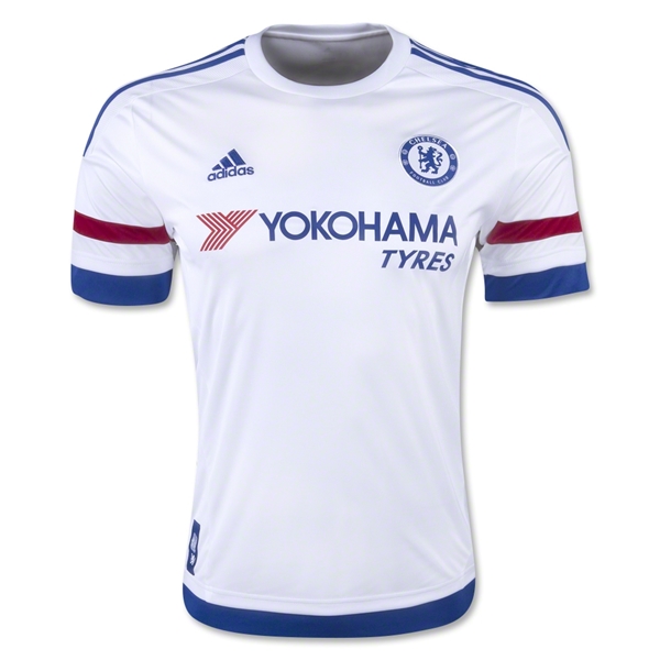
9. Chelsea Away
(Technically Chelsea and Newcastle tied but I decided that he tiebreaker was likability. So Chelsea loses.)
No Vertical Stripes: 5
Color Combination: 5
Crimson, white and blue almost always work - especially when the primary color is white which gives it an extra clean feel. Being a dirty nasty team, this is important for them.
Likability of Team: 0
As an Arsenal fan I’m obligated to despise pretty much everything about this team. The away jersey is the one exception.
Is It Arsenal: 0
Nope. It is definitely not Arsenal.
Team Logo/Crest: 4
Single color, cool lion and very soccer. Not bad Chelsea, not bad.
Sponsor Coolness: 2
Tyres are definitely not kool.
Sponsor Logo: 1
The simple Samsung logo would have been much better. Its not bad, but anytime you have to place words to the left or right underneath it loses symmetry and impact.
Manufacturer: 5
Adidas is classic and simple. Love the 3 stripes on the shoulders.
Bonus: 3
The stripe combos on the sleeves, shoulders, and bottom of the kit are pretty slick.
Total: 25
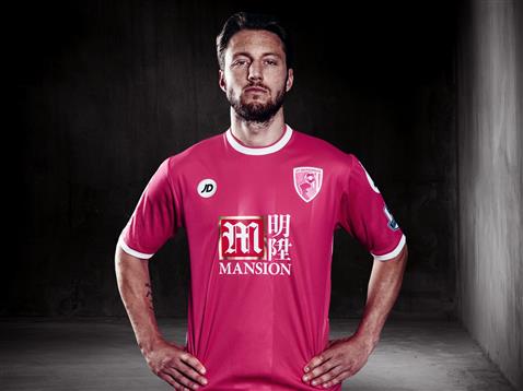
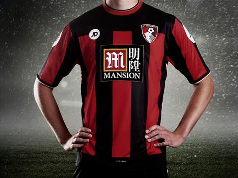
10. Bournemouth 3rd
No Vertical Stripes: 5
Color Combination: 5
I’m a big fan of simple color design done well. Pink is an odd choice at first but complimented with simple white and having the shorts and socks match really work. This kit makes the top ten on the strength of its colors. It overpowers all the other really negative elements.
Likability of Team: 2
Unless you’re from Bournemouth (assuming its a city) you probably didn’t even know they got promoted.
Is It Arsenal: 0
No. Bournemouth is not Arsenal.
Team Logo/Crest: 1
This crest is an absolute horror. The only thing that saves it from getting a flat zero is the flat 2 color design.
Sponsor Coolness: 0
Casino and gambling sponsors spell cheap and easy money.
Sponsor Logo: 1
Like most Asian sponsors, this doesn’t translate well to a western audience. It is slightly better than their home/away kits because you don’t have that ridiculous box behind it – again saved by the color scheme.
Manufacturer: 3
Clean and simple it works. Would have been higher except those logos on the shoulders are so large, you could probably land a helicopter on each.
Bonus: 4
Points for giving money from sales to breast cancer research. Imagine if an NFL team donned all pink!
Total: 21
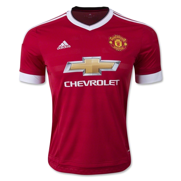
11. Manchester United Home
(Man U and Bournemouth tied but since I don't like Man U they get the boot. They should consider themselves lucky to make the list.)
No Vertical Stripes: 5
Color Combination: 4
Red and white with a splash of gold is always classy.
Likability of Team: 0
Man U is slightly ahead of Tottenham only because I’m required to hate Spurs the most. I can’t get away from constantly hearing about them because my assistant is a massive fan which makes him a massive pain.
Is It Arsenal: 0
No. Most definitely not.
Team Logo/Crest: 2
Classic, but typically evil. Nice pitchfork you devil worshipers.
Sponsor Coolness: 5
American car manufacturer on an EPL jersey. That is cool.
Sponsor Logo: 1
The metal gradient absolutely kills me and this kit. As much as I hate ManU this is a quality kit save for this abhorrent logo choice. If they would have done a white outline of the Chevy logo this kit goes right to the top.
Manufacturer: 5
Much like Chelsea, Adidas has brought a retro flair which really looks good.
Bonus: -1
For being Man U.
Total: 21
Honorable Mention
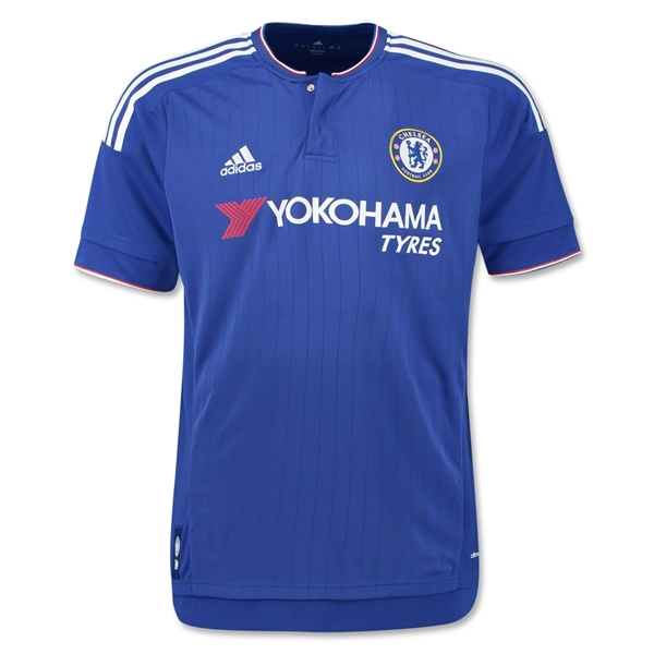
Chelsea Home - clean yet boring.
Liverpool Home - again, classic but boring.
Newcastle United Away - Despit the terrible sponsor logo, Puma's argyle works here for some reason.
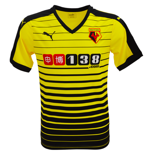
Watford Home - Its like a bad accident. You can't look away. It is horrifyingly appealing.
The Worst of the Worst
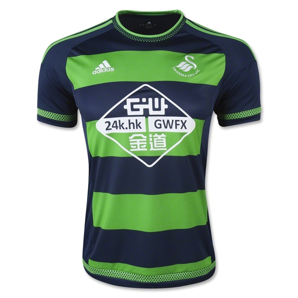
-1. Swansea City Away
No Vertical Stripes: 0
Yes I know the stripes are horizontal but if you turn your head to the side they’re vertical. And that’s kind of what you do when you see this jersey. You inquisitively tilt your head to the side because you’re not quite sure what you’re looking at.
Color Combination: 1
Neon green and navy aren’t a bad combo as long as one is an accent and not the full thing. These massive green stripes look like highway worker at a rave. Just awful. One stripe and you’ve got the making of a sweet kit.
Likability of Team: 2
I’ve always been intrigued by Swansea City. Not sure why. Maybe its the allure of the swan… But they’re a middling also ran as well.
Is It Arsenal: 0
No they are not Arsenal.
Team Logo/Crest: 4
Swans aren’t exactly what you think of when there are sports teams involved but this is a well designed logo. Simple, stylish and memorable. Its the most redeeming part of this jersey.
Sponsor Coolness: 4
They deal in gold so that’s pretty cool.
Sponsor Logo: 0
Again, Asian logos don’t translate well. This one reminds me of a 24k modem. At least its in one color and has a knockout background, though I don’t really want to see that background.
Manufacturer: 0
It was Adidas’ choice to make these hideous kits so they bear the brunt of this penalty.
Bonus: 0
The home jersey, hideous logo and all isn’t bad which makes their away kit all the worse.
Total: 11
-2. Bournemouth Home
Vertical Stripes: 0
Vertical stripes are present and very ugly.
Color Combination: 3
Red and black are always competing for dominance, but if you’re going to do vertical stripes better to have low contrast.
Likability of Team: 2
Unless you’re from Bournemouth (assuming its a city) you probably didn’t even know they got promoted.
Is It Arsenal: 0
Team Logo/Crest: 0
Any crest that has an actual soccer ball in it loses points since. This one is especially bad because at first glance I thought it was a bird but actually is a human head. Looks like it was designed by a dude at the local pub for his weekend team.
Sponsor Coolness: 1
Casino and gambling sponsors spell cheap and easy money.
Sponsor Logo: 0
Way too busy. Because of the vertical stripes they have to put a black square behind it all. Tacky and ugly.
Manufacturer: 1
Those vertical stripes kill everything. The JD on the front is actually simple and nice but the need to put it in a filled circle ruins it. Then add in the massive manufacturer logos on the sleeves and this jersey is officially one of the worst.
Bonus: -1
I went to their team site for closer look and the shop was under construction. Maybe they are building some new jerseys to sell. A week into the the season starting and their online store is under construction??? Are you kidding me?
Total: 6
-40. Norwich City 3rd
There are hardly words to describe... No rankings for this monstrosity. It gets a strait zero across the board. Whoever thought it was a good idea to put large green, orange and yellow stripes together must either be a Tottenham fan or certifiable.
What are your favorite kits for his season? Hit me up in the comments.
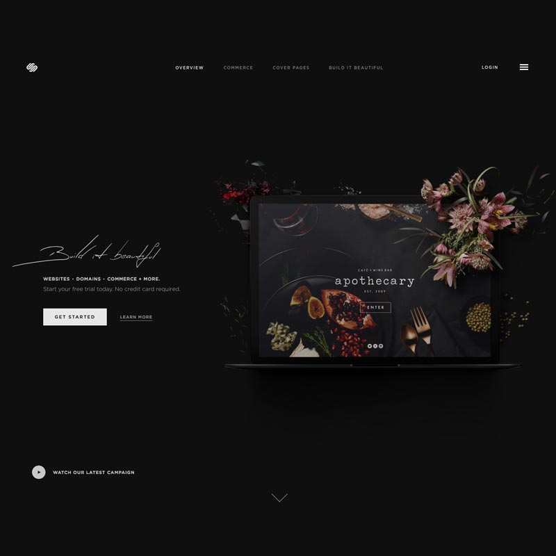
Why I Chose Squarespace Over WordPress
It was the summer of 1997. I had just graduated high school and was preparing to start my freshmen year of college.
During that last summer some friends and I attempted to start our own pop a cappella group. Think Pentatonix 15 years before it became cool...
We needed a website. So I built my very first site using everyone's favorite software, Front Page.
While those first sites were just static html pages, I eventually moved on creating dynamic sites connected to a database first with ASP and then with PHP.
As the sites became more and more complex and my database needs grew, it became harder and more time consuming to create my own stuff from scratch. That's when I discovered WordPress and it was magical.
I first started with WordPress 1.8 and have been using it ever since. WordPress worked so well that I wrote plugins, built themes, attended conferences, helped in the support forums and ultimately built my own business around the software.
I would later work for Copyblogger, an amazing company whose products are built around WordPress.
The beauty of WordPress is twofold in my opinion.
- It can do anything you want.
- There are literally millions of people, articles, videos and forums that can help you do anything you want.
That all said, In November of 2013 I moved my longtime WordPress site to Squarespace and this past year I also built the new site for our church on the Squarespace platform.
Why?
I no longer had my own business or worked for a company built around WordPress
If I was still building sites for clients I would definitely be using WordPress. The open source nature of the software gives me peace of mind that I am in control of the code. It lives and breathes on my server.
Payment Integration in WordPress is still a Nightmare
I started selling artwork on my site a few years ago and to give customers a good experince I wanted all integrated in my site. Having to manage my own security, and trying to integrate payment solutions in with my custom design was ridiculously time consuming.
Squarespace has payments built in and very tightly integrated with the software. It was plug and play. Super easy.
Less Decision Making
In the case of our new church site I originally started to build it in WordPress but was quickly bogged down by the amount of options available to me. I knew what the site needed to do but how to lay it all out and integrate in the face of many deadlines became cumbersome.
Squarespace because of its limitations, made many decisions for me and saved me tons of time.
I know that everyone won't see this as a feature, but for someone who likes to constantly tinker it was a lifesaver.
The Squarespace Layout Engine
Most WordPress templates may have a few options when it comes to layout out content in a blog post or page but for the most part, you are restricted to those layouts unless you code your own. Squarespace and its layout engine is amazing. I can place and position content any way I want and truly achieve magazine level layout.
To be fair, its not all roses. When the layout engine decides not to work it is an absolute nightmare and brings work to a standstill. Thankfully, that hasn't happened very often.
Squarespace has a Beautiful Admin
WordPress has been slowly improving this over the years but the admin has always lacked style. It was never visually pleasing to log in and work. Squarespace has put as much or maybe more time in making the admin function well and look beautiful.
Function wise you probably can do less with Squarespace but like Apple vs. Microsoft it just feels good to look at use.
I also like that Squarespace admin gets out of the way. The only time it takes up more than a sidebar in your screen is when you are writing or designing new content. The admin is not the focus, your content is.
Everything About Squarespace is Clean and Simple
This is a huge advantage for Squarespace as they don't have to conform to a massive community of needs. They decide what is important and what's not. The result is clean and usable. To be sure, you don't have the options you may with WordPress but what is there is clean and easy to work with.
See the comment about the admin above...
The Downside
Lest everything seem rosy, there were compromises I had to make. The community forums are next to worthless. Doing simple customization is hard without learning a brand new templating language. The layout engine can be quirky and when it doesn't work right you want to break your computer.
Conclusion
For all of those reasons Squarespace is the right fit for me right now. That will surely change as my needs and desires change. But for now, its home.