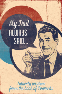
Designing the Series My Dad Always Said
I started in my role as Communications Pastor here at Willow Creek this past May and while I had the opportunity to design the branding for the previous two sermon series I had not developed an entire creative package for a sermon series.
My first opportunity to do that was this last summer when we went through the book of Proverbs. Inspired by the Sunday Mag in which they describe in a series of posts one church's creative process in designing their Christmas service, I'm going to attempt to give you an idea of how we produced and designed the sermon series My Dad Always Said.
The Series/Service
The series My Dad Always Said was intended to be a short series during the summer that looked at various topics in the book of Proverbs. As most of the Proverbs were written by Solomon to his son the big idea was fatherly advice on how to live skillfully.
The Title
Our lead pastor came up with the basic idea for the title and with a little bit of tweaking and talking we came to settle on "My Dad Always Said."
We wanted to focus on the theme of fatherly advice since it is the perspective that most of the book of Proverbs is written from and it seems that whenever someone dispenses fatherly advice, normally the person says: "Well you know, my dad always said..."
The title also points us to our heavenly father who is the perfect father and who's advice and commands we should always follow.
The Feel
As soon as I heard the title, my first thought was 1950's, Father Knows Best.
I wanted us to harken back to an era where dad was taken more seriously than the bumbling idiot of sitcoms today so a vintage look and feel felt very appropriate.
And while I wanted the role of fatherly advice to be taken seriously I also wanted to keep it light, fun and a little tongue-in-cheek since this was a summer series.
The Visuals
For all the series I've designed here at Willow Creek I've started not necessarily with a logo for the series but with a main graphic that has primarily come in the form of a poster. To create this main graphic I typically search stock photo sites and Dribbble and gather images for an idea board. This was the board I created for this series.

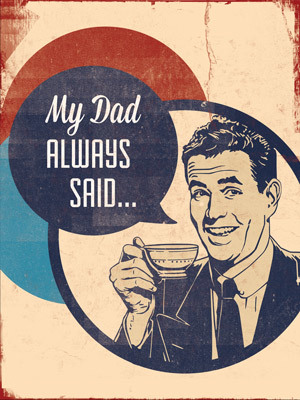
Since the feel of the graphics were vintage, all american and fun I went with a faded color palette of red, blue and cream from the vote republican image.

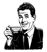
I really liked the idea of the 50's man in the ad but wanted him to be in more of a conversation dispensing wisdom. This image had to be perfect. It had to have that vintage look while still coming off as whimsical and fun.
Thousands of images later I found the one I ultimately ended up using. It has the classic 50's mad men look while still raising an eyebrow in fun.
The fonts came from the brilliant people at Lost Type Co-op. For this project I selected Fairview and Mission Script.
And then putting it all together I designed one large format poster for the stage.
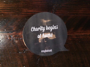
The second part of the visual strategy was to place "dad quotes" all over the church building. I asked our people to write in with bits of wisdom and fatherly advice they remembered from their dad's or someone influential in their life. We then printed these out and posted them everywhere in the building.
Fun and Reinforcement
One of my main goals for this series was to get people to interact with it in a way that would be enjoyable and also reinforce the idea of fatherly wisdom and living skillfully.
We did this in two different ways.
The first was to create a social media campaign that revolved around the hashtag #myDadsaid. We asked our people to tweet and post on Facebook quotes from their fathers. We would then run these pre-service on our video boards. To encourage people to post we would give away random gift cards to the first person who tweeted with the hashtag or replied to a Facebook post.
The second way we got people to interact with the series was to build a giant mural of a dad sitting in an easy chair reading the paper. One of our talented artists, Abby Charlton, painted the mural, cut out the face so people could pose with their faces as the dad and stuck a whiteboard quote symbol pointing to the face where people could write in their own quotes while posing.
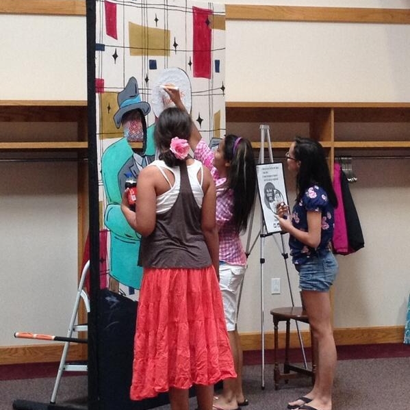
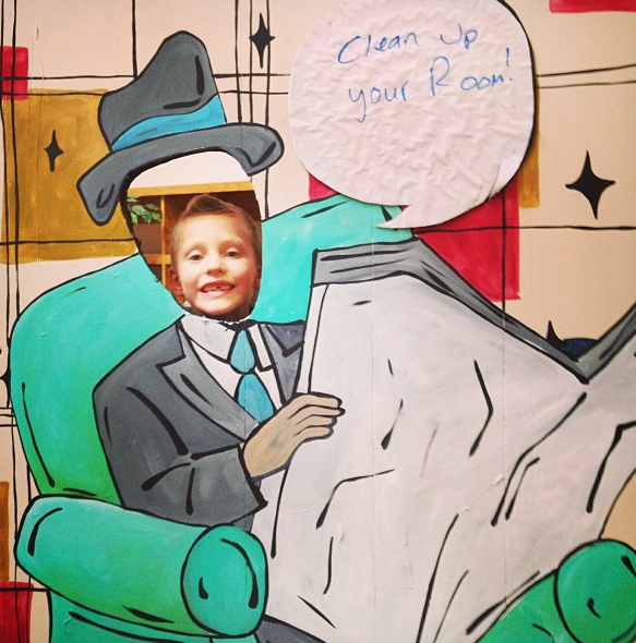
We encouraged people to take pictures and then post them to Instagram or other social media sites. The kids especially loved this and wrote in all sorts of things they heard from their dads.
Stage Design (lights and sets)
There wasn't a lot of stage design involved this time around. This was due to the fact that it was a shorter series and this was the first time we've tried to create a complete package for the series. Less was better.
We ended up hanging the poster on the stage and spotting it with a single led light that had the ability to gradually shift the colors.
The only other set piece was the photo booth I mentioned before which was probably the highlight of everyone we designed.
The Challenges
We had really wanted to use and promote the social media campaign during the services even having live tweets and pictures show up pre-service. I've been to conferences before where this is done and this has been a huge draw to get people interacting with the campaign.
This didn't happen primarily because the software required was way too expensive. There were some cheaper workarounds but there was always a key feature that wasn't included like being able to moderate what was posted.
It was also a challenge to get people to interact in general with the social media campaign. This was something brand new for us so hopefully in the future we'll learn how to engage people better.
Takeaway
It was very exciting to see all the elements come together and a ton of fun to have almost complete creative freedom to try anything out. I have a ton of support from the staff and people to be creative and take risks like the photo booth and social media campaign.
While the photo booth was a hit there are a lot of things we can do better and I can't wait to jump into the next project.

