Project Overview:
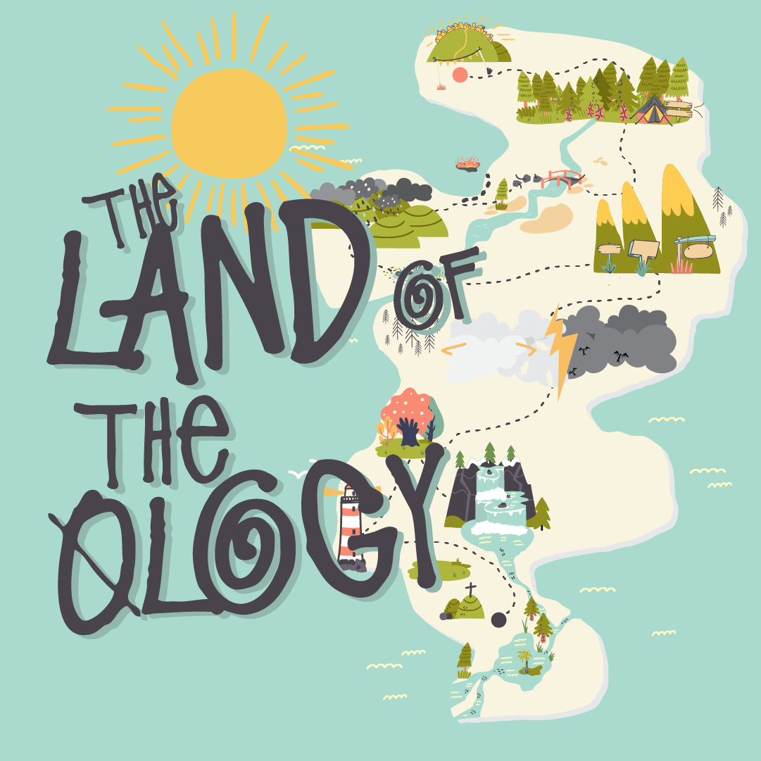
The Land of the Ology is a visually rich, illustrated map designed to teach key Christian doctrines to both adults and children in an engaging and accessible way. The project is set in the whimsical world of “Ology Island,” where each doctrine of the Christian faith becomes a location to explore, complete with symbolic names and visual elements. The map integrates theological education with artistic symbolism to make complex concepts approachable, especially for a younger audience.
Target Audience:
The primary audience for this project is families, with a special emphasis on children. The goal was to make doctrinal teachings both understandable and fun. This map also appeals to youth pastors and children’s ministry leaders looking for dynamic tools to teach theological concepts visually.
Design Objective:
The objective was to create an immersive, adventure-style map that could simplify complex theological doctrines while maintaining theological accuracy. The map had to be both visually captivating and informative, guiding both adults and young learners through different Christian doctrines in a way that feels like a fun, exploratory journey.
Design Process:
1. Conceptual Development:
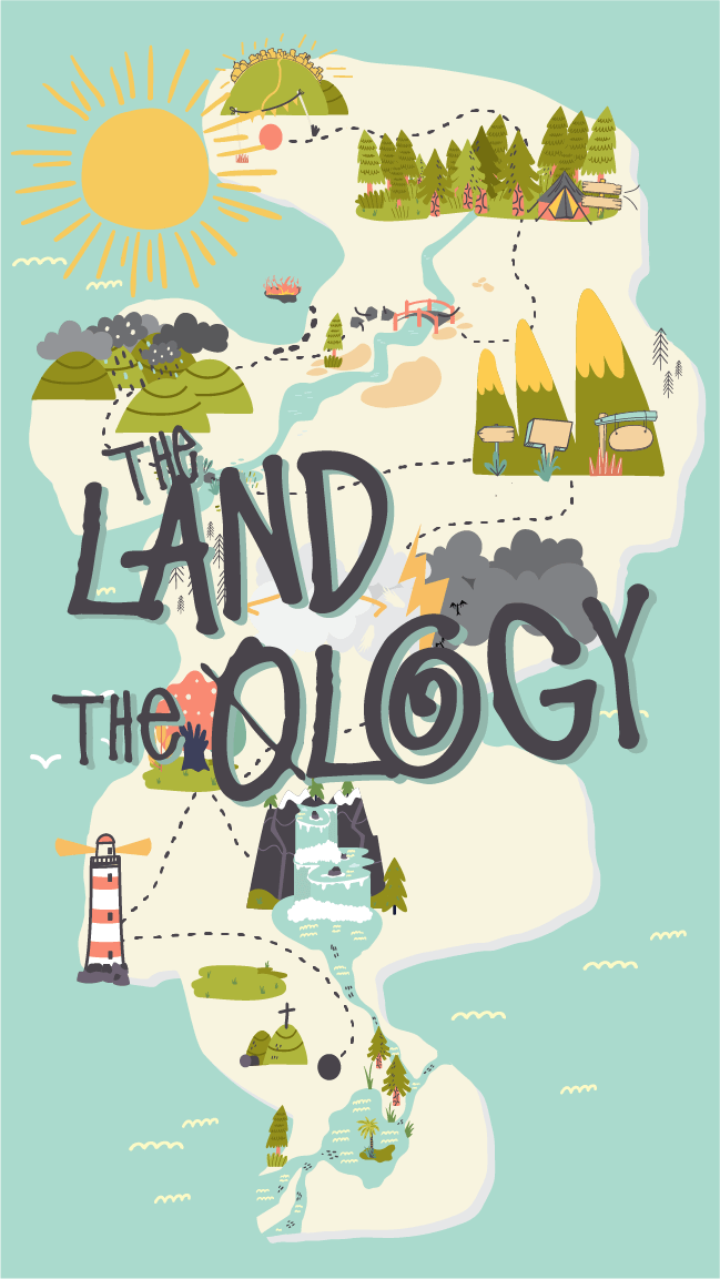
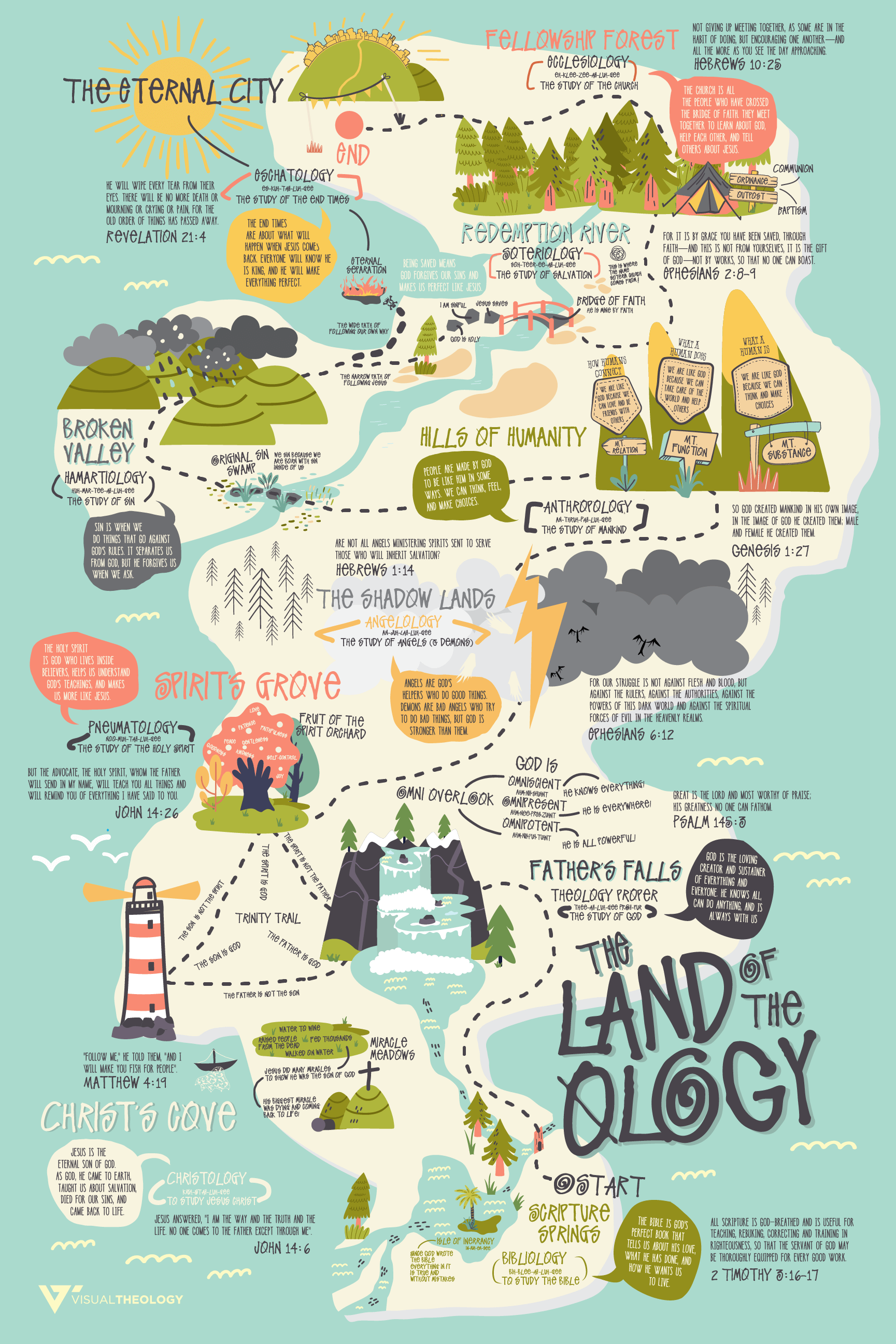
The concept of The Land of the Ology was inspired by a desire to integrate theological education with whimsical, visually engaging design. I wanted to incorporate major Christian doctrines as waypoints or spots on a journey, with playful and imaginative names such as “Father’s Peak” (for the doctrine of God), “Savior’s Summit” (for the doctrine of Jesus), and “Broken Valley” (for the doctrine of sin). Pilgrims Progress and The Lord of the Rings were obvious starting points for inspiration about the map and the journey. There was a clear intention to give each doctrine a unique and fitting visual identity, avoiding overuse of repetitive naming conventions (e.g., ‘forest’) to ensure each location stood out with a distinct feel.
2. Mapping the Journey:
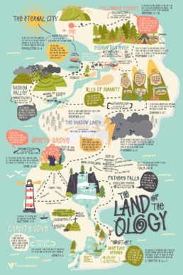
The core structure of the map was designed around the 10 key Christian doctrines:
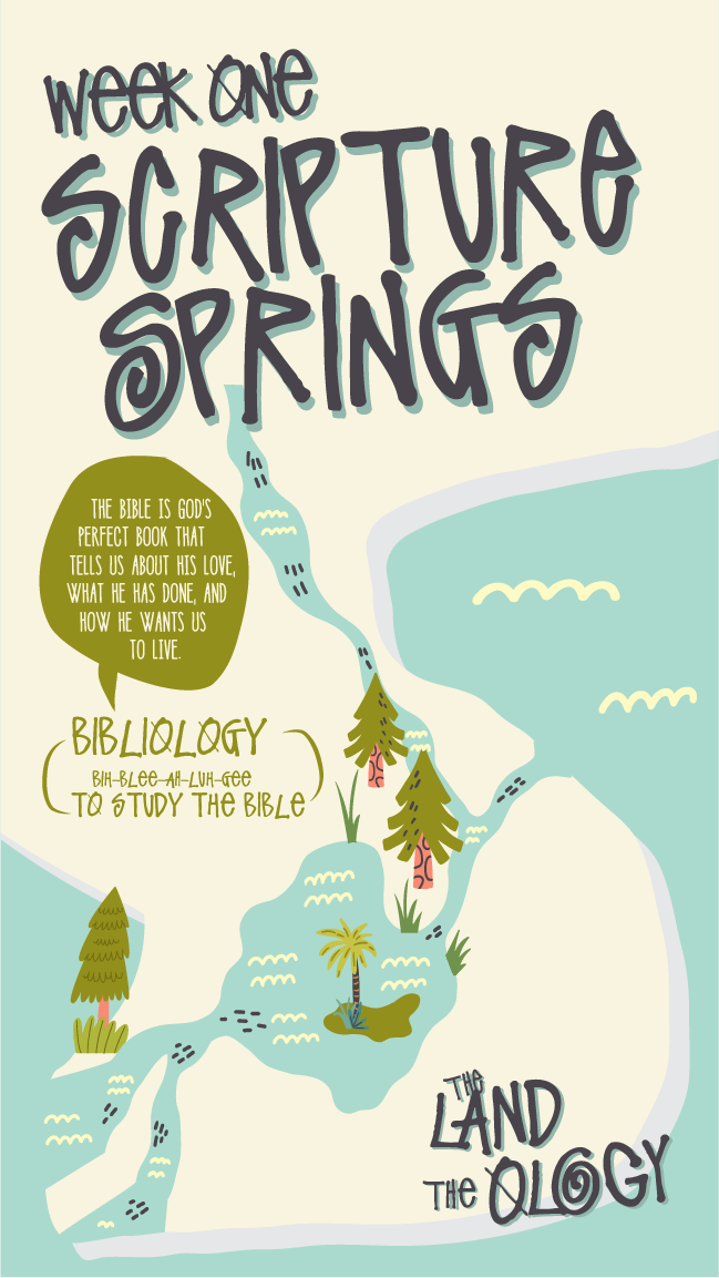
- Bibliology: “Scripture Springs” serves as the starting point, symbolizing the importance of the Bible.
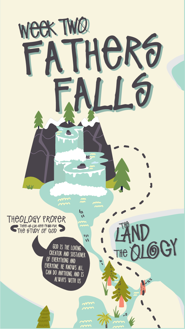
- Theology Proper: “Father’s Falls” presents the study of God, with cascading waterfalls representing the majesty and omnipotence of God.
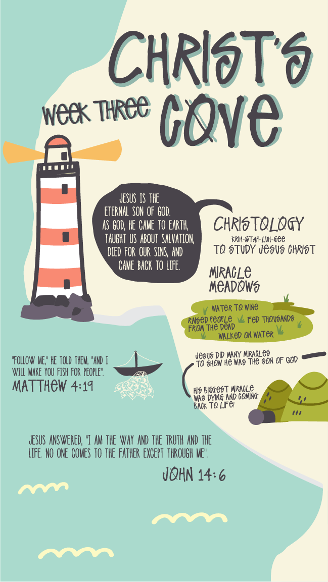
- Christology: “Christ’s Cove,” featuring a lighthouse, evokes themes of guidance, salvation, and light.
- Pneumatology: “Spirit’s Grove” uses natural imagery to convey the presence of the Holy Spirit and the fruitful life led by walking in the Spirit.
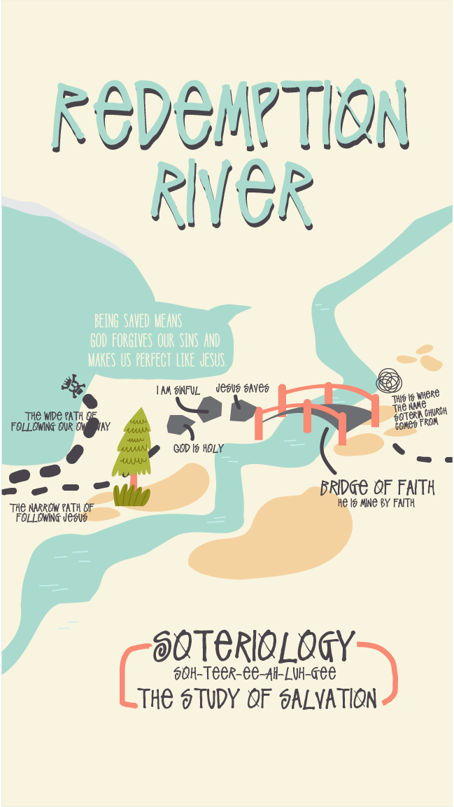
- Soteriology: “Redemption River” signifies salvation, flowing with grace and faith.
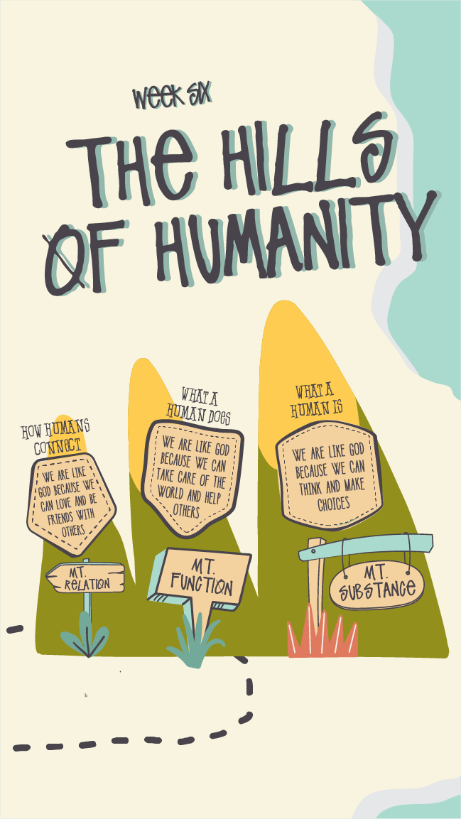
- Anthropology: “Hills of Humanity” captures the essence of human nature, emphasizing mankind’s creation in God’s image.
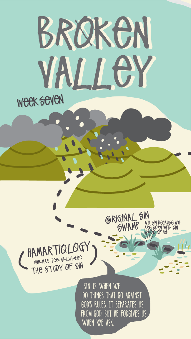
- Hamartiology: “Broken Valley” represents the fall and the sin that permeates humanity, with dark, foreboding imagery of sin and suffering.
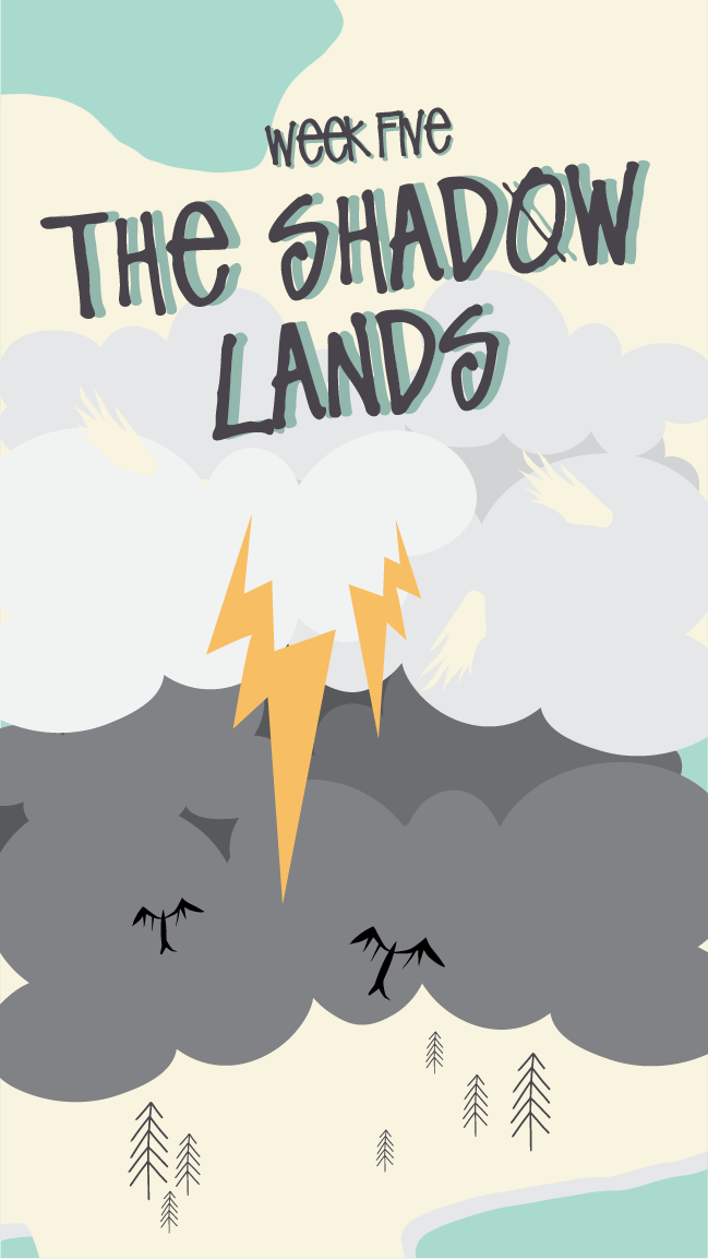
- Angelology: “The Shadow Lands” is where the study of angels and spiritual warfare is represented, with shadowy clouds and spiritual battle imagery.
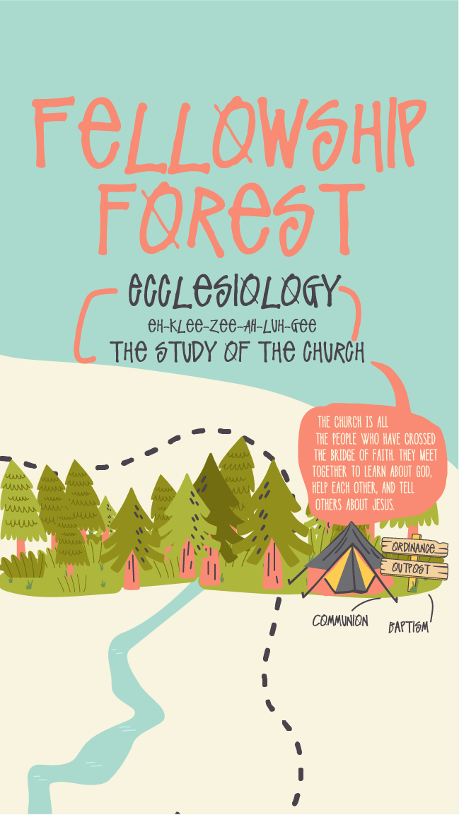
- Ecclesiology: “Fellowship Forest” represents the church as a community of believers, symbolized by a serene and welcoming forest.
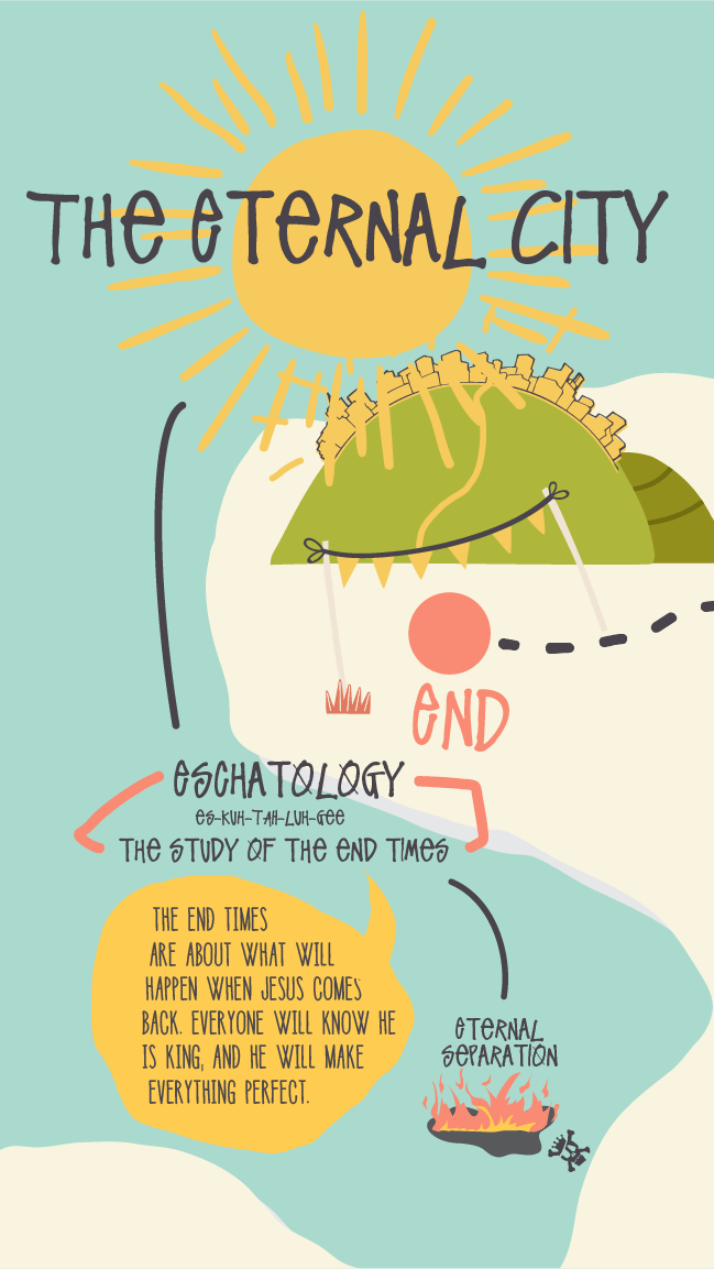
- Eschatology: “The Eternal City” concludes the journey, representing the end times and the ultimate fulfillment of God’s plan.
Each doctrinal waypoint is accompanied by Scripture references and theological insights, making the map a rich educational tool as well as a visual experience.
3. Visual Style and Aesthetic:
The chosen aesthetic was whimsical yet rooted in theological symbolism, combining bright, playful colors with clean lines and clear text. The design takes inspiration from children’s illustrated maps, using exaggerated, imaginative visuals to guide the viewer through the various “locations” that represent theological truths. Consistent use of path lines, banners, and symbols (e.g., mountains, rivers, trees) unifies the design while making the map easy to navigate.
Visual details such as the stormy clouds over “Broken Valley” to signify sin, and the sunny, glowing depiction of “The Eternal City,” are crafted to evoke emotion while communicating deep theological meaning.
4. Illustration and Typography:
Vector illustrations were employed to maintain a simple, modern aesthetic while keeping the design scalable for various formats, including posters, teaching curriculums, and digital assets. Typography was deliberately chosen to be both playful and legible for younger readers, with key terms and Scripture quotes highlighted in bold, hand-lettered style to draw attention.
5. User Feedback and Revisions:
Throughout the design process, feedback focused on ensuring theological accuracy while maintaining visual engagement. Adjustments were made to the visual hierarchy, ensuring that key elements like Scripture verses and doctrinal themes were immediately accessible to the viewer. The path of the map was carefully reworked to allow a smooth “journey” through the island, ensuring that children could intuitively follow the doctrinal storyline.
6. Final Design Output:
The final output was a full-color illustrated map measuring approximately 24×36 inches, suitable for classrooms, homes, and church settings. The design allows for various formats, including smaller prints (8.5×11) and other poster sizes, and individual social media graphics for each week ensuring versatility in use.
Design Challenges and Solutions:
Challenge 1: Simplifying Complex Doctrines for Children
- Solution: Doctrines were personified as locations with vivid imagery that symbolized their meaning, such as “Broken Valley” for sin, helping children connect emotionally and visually with the concepts.
Challenge 2: Maintaining Visual Cohesion Across Varied Doctrines
- Solution: A consistent color palette and visual language (e.g., natural elements like trees, rivers, mountains) were used throughout the map to unify diverse theological concepts into one cohesive journey.
Challenge 3: Avoiding Repetition in Naming
- Solution: A variety of creative names like “Fellowship Forest” and “Redemption River” ensured that no two doctrines had overly similar visual or linguistic identities.
Conclusion:
The Land of the Ology successfully combines rich theological teaching with captivating illustrations, creating a memorable and impactful resource for children, youth pastors, and Christian educators. The project stands as a testament to the power of visual communication in teaching faith-based concepts, blending education with imaginative storytelling to draw young learners into the depths of Christian doctrine.