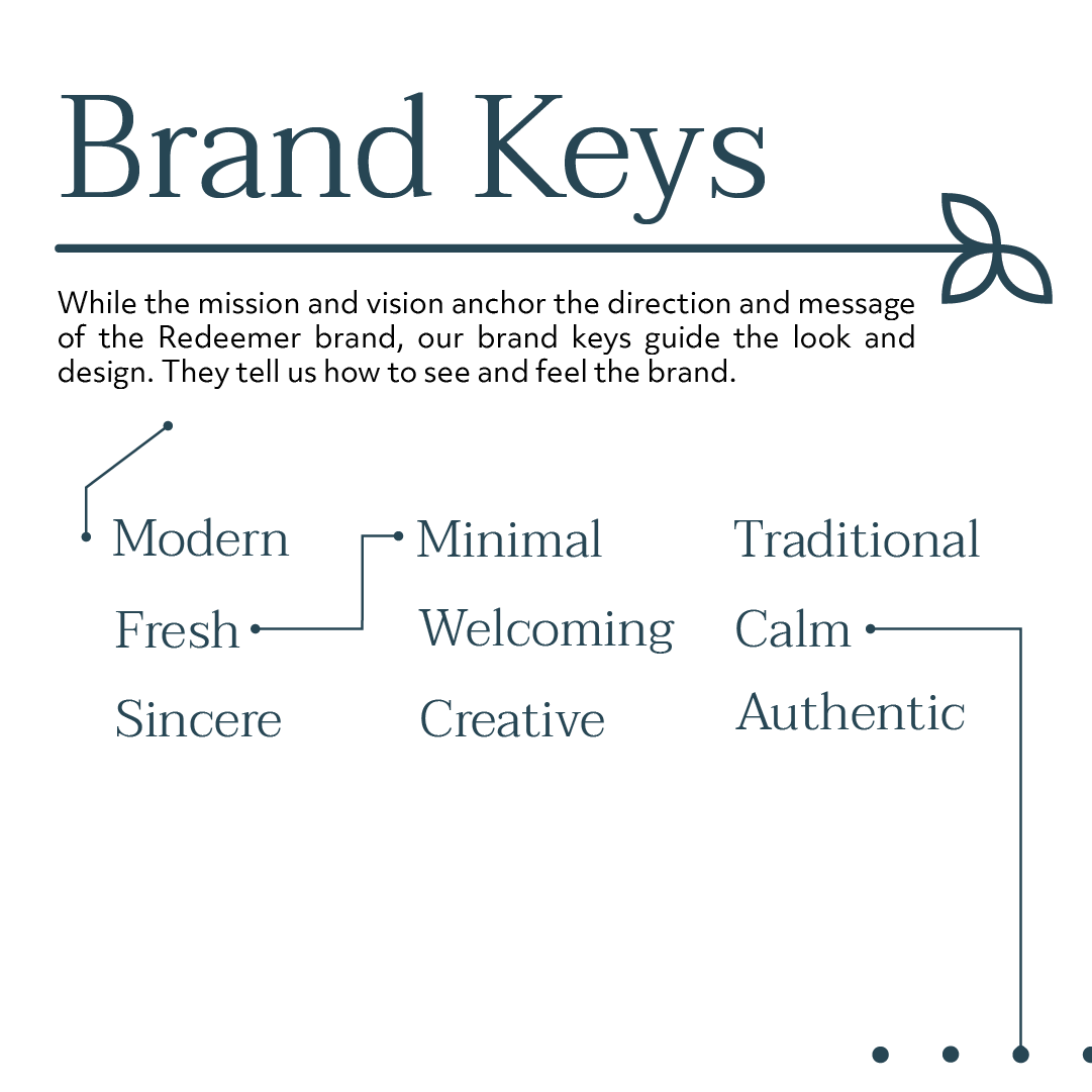
When Redeemer Church in Florida approached me for a brand refresh, their goal was clear: they needed a visual identity that spoke to their mission of making disciples who look to Jesus and live for Jesus. It was essential that the new look felt both welcoming and sincere while remaining minimal, modern, and deeply rooted in their local community.
The challenge was to create a cohesive identity that would capture Redeemer’s essence. I pointed them to a traditional and fresh brand that reflects their expository preaching and intentional discipleship while appealing to the modern viewer.
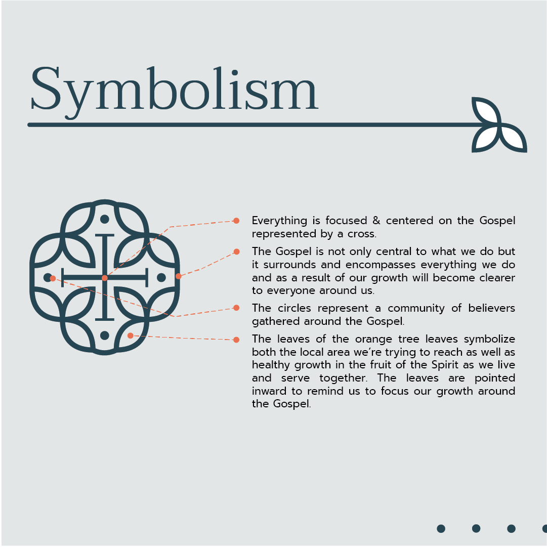
I centered the design around their core values of the gospel, community, and growth. The cross became the focal point, surrounded by circles representing a community gathered around the Gospel. Orange tree leaves symbolized the local area and spiritual growth and added a unique and meaningful touch.
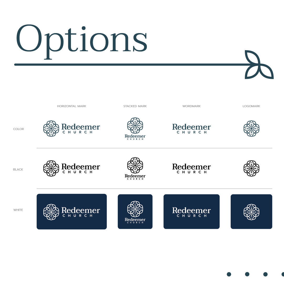
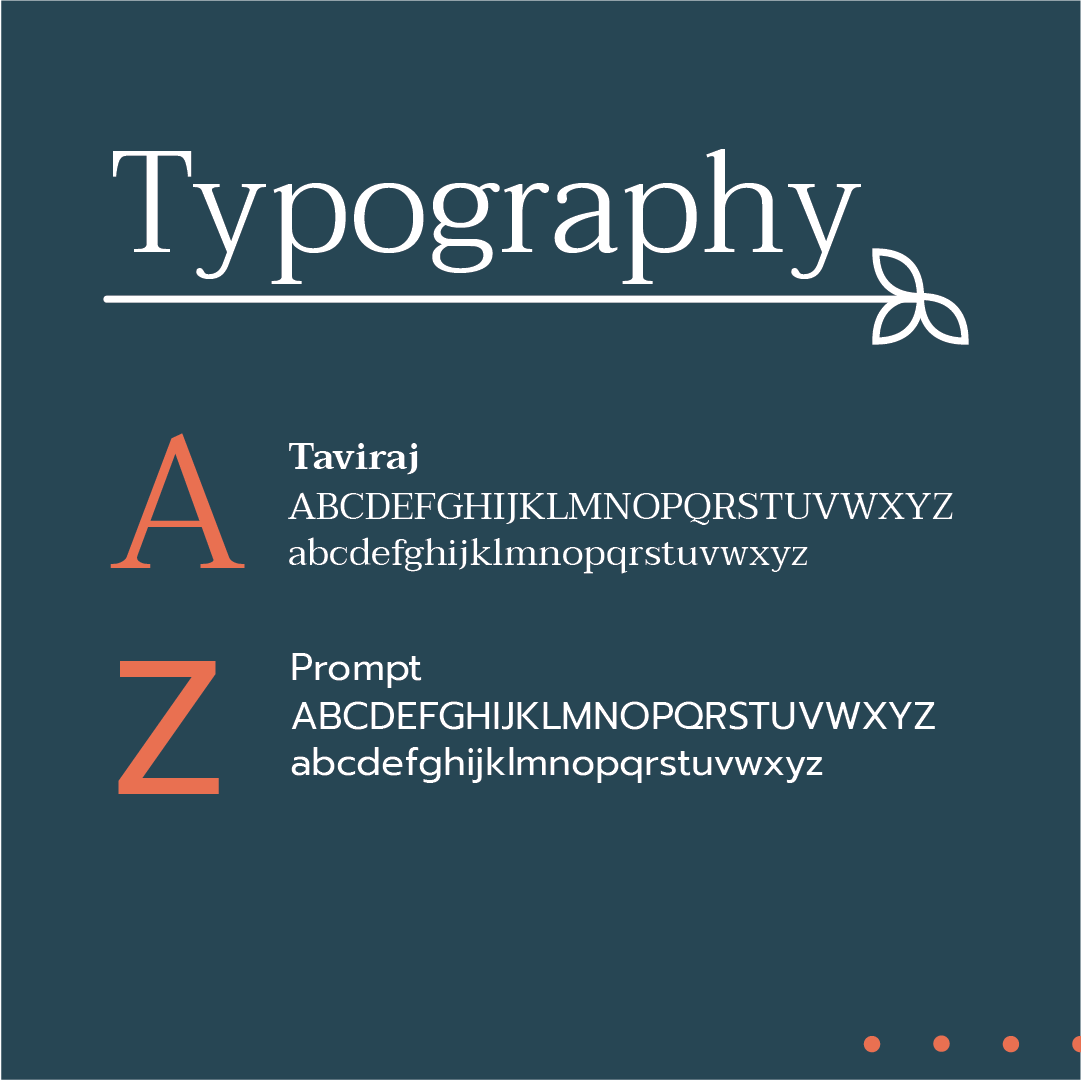
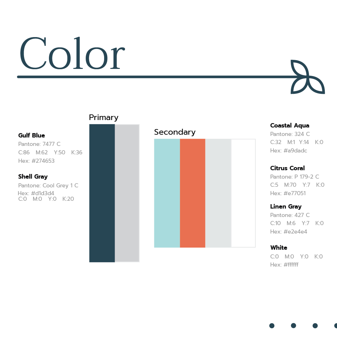
The logo system I developed was versatile, with modern fonts (Taviraj and Prompt) and a calming color palette dominated by “Gulf Blue,” complemented by Coastal Aqua and Citrus Coral. These elements were designed to convey the church’s welcoming and authentic nature.
The final brand looks excellent and effectively communicates Redeemer Church’s warmth, creativity, and Gospel-centered focus. Their new visual identity will help them connect with their community and newcomers, solidifying their presence as a modern church deeply rooted in tradition.