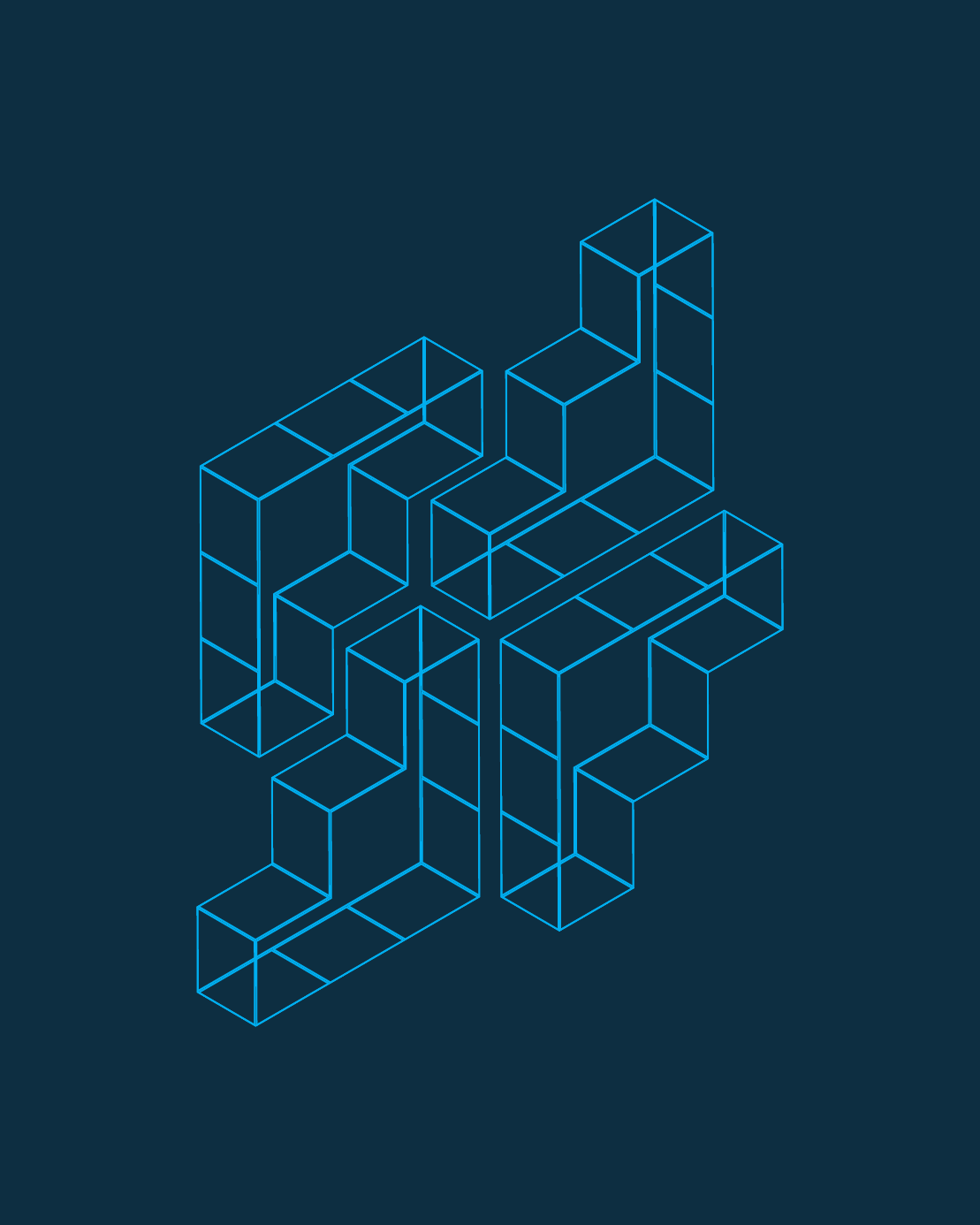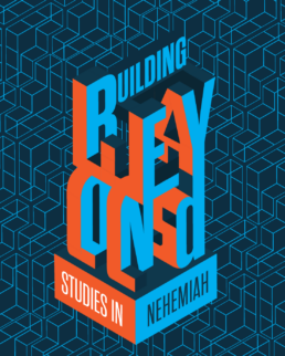
I designed this branding for a sermon series and an upcoming building campaign. The obvious inspiration is a wall/building-like structure, but the fun part was using the entire title to make up the walls and buildings. It has an MC Escher vibe that makes you look twice to try and figure out how everything connects :)
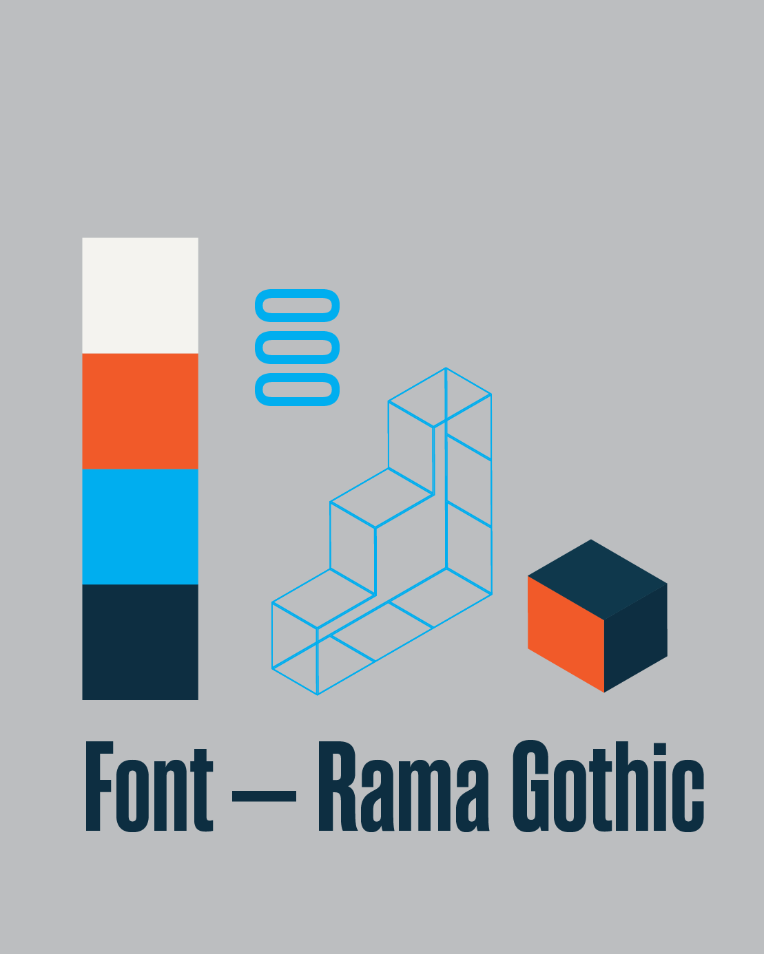
The other images show the rest of the brand kit, including a pattern made of isometric blocks, the font, and the color palette.